


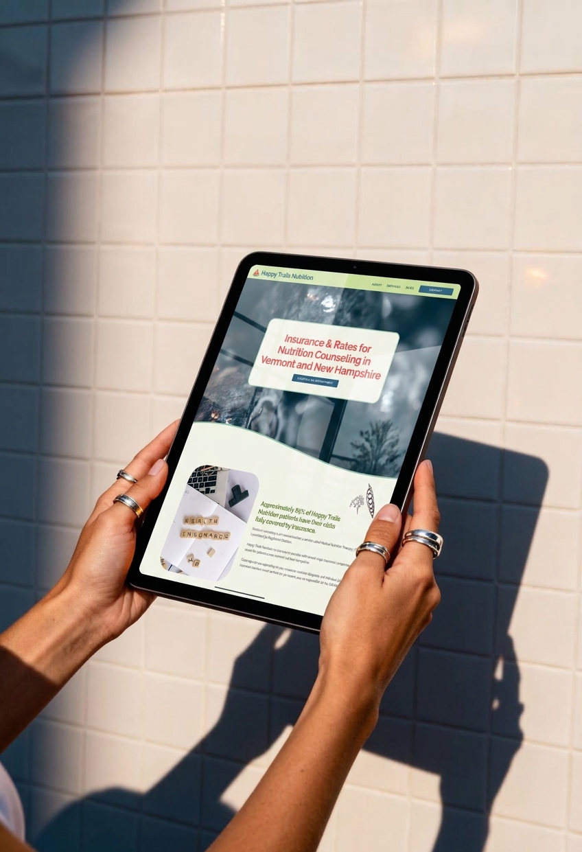
- Insurance-Based Nutrition Website Design for Happy Trails Nutrition
- The Challenge
- Making Insurance Information Easier to Navigate
- Letting Happy Trails Have Some Fun
- Designing the Path From Discovery to Booking
- A Website That Made a Measurable Difference
- What Jen Had to Say
- Your Nutrition Website Should Make the Next Step Clear
- Insurance-Based Nutrition Website Design FAQ
Insurance-Based Nutrition Website Design for Happy Trails Nutrition
The Scope: Custom Showit Web Design
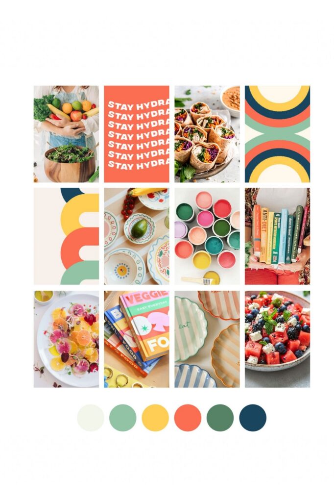
The Vibes: Playful, colorful, moderne
The Industry: Insurance-Based Nutrition Counseling
Happy Trails Nutrition already had a strong personality. What it needed was a website that actually reflected it.
Jen wanted a more polished online presence for her growing nutrition practice, but she didn’t want to lose the personality that made Happy Trails feel approachable and different from a typical healthcare practice.
For this insurance-based nutrition website design, I focused on creating a fun, modern experience that made the practice feel more like itself while also making important information, especially insurance coverage, much easier for potential clients to understand.

The Challenge
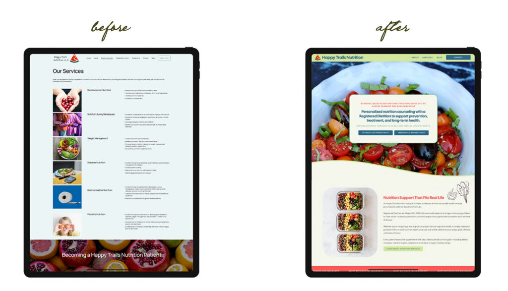
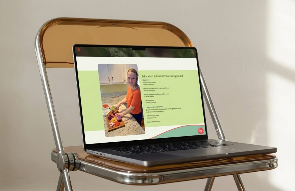
The previous website felt basic and didn’t fully communicate Jen’s experience or the level of care she provides.
She also wanted her own photography to play a bigger role in the website. Her images brought personality and a sense of fun to the brand, so rather than relying on generic wellness photography, I wanted the new site to give those images room to shine.
At the same time, the website needed to answer some very practical questions.
Potential clients needed to understand what services were available, whether their insurance was accepted, what their coverage might look like, and how to get started. Insurance can already feel confusing, so the website needed to make that information straightforward without making the overall experience feel overly clinical.
Making Insurance Information Easier to Navigate
One of the biggest priorities was restructuring the website around the questions potential clients actually have.
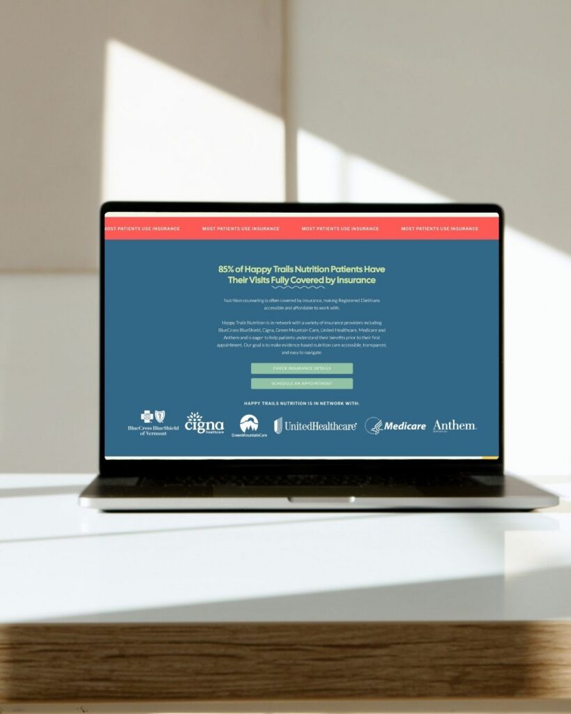
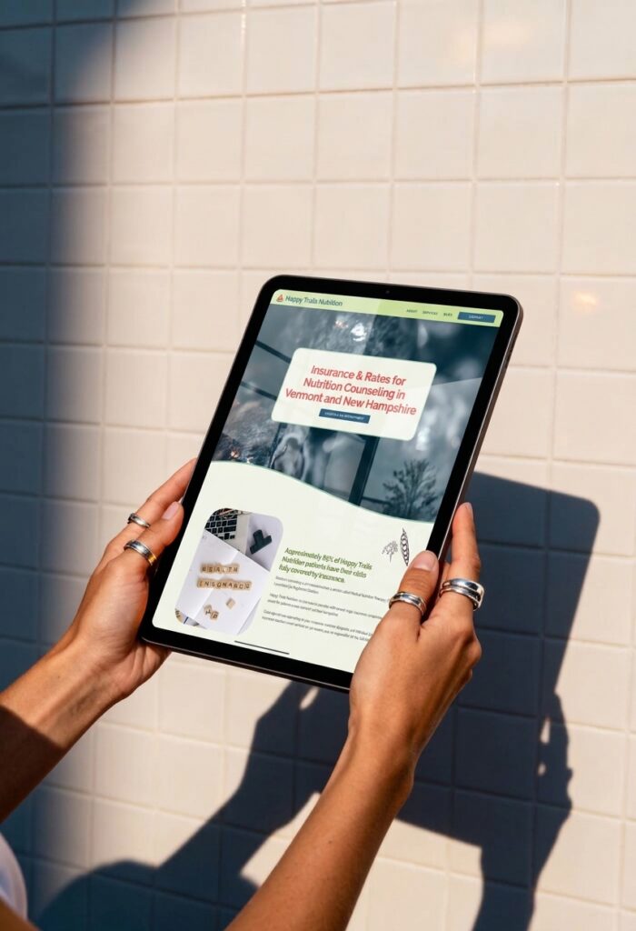
I created a dedicated Insurance page that walks visitors through coverage details, answers common questions, and explains what information they may need to request from their insurance provider.
Instead of making visitors dig through the website to figure out whether Happy Trails was an option for them, the new structure puts that information where they can actually find it.
That clarity became an important part of the overall insurance-based nutrition website design, helping visitors move from “Could I work with this practice?” to “Okay, I know what to do next.”

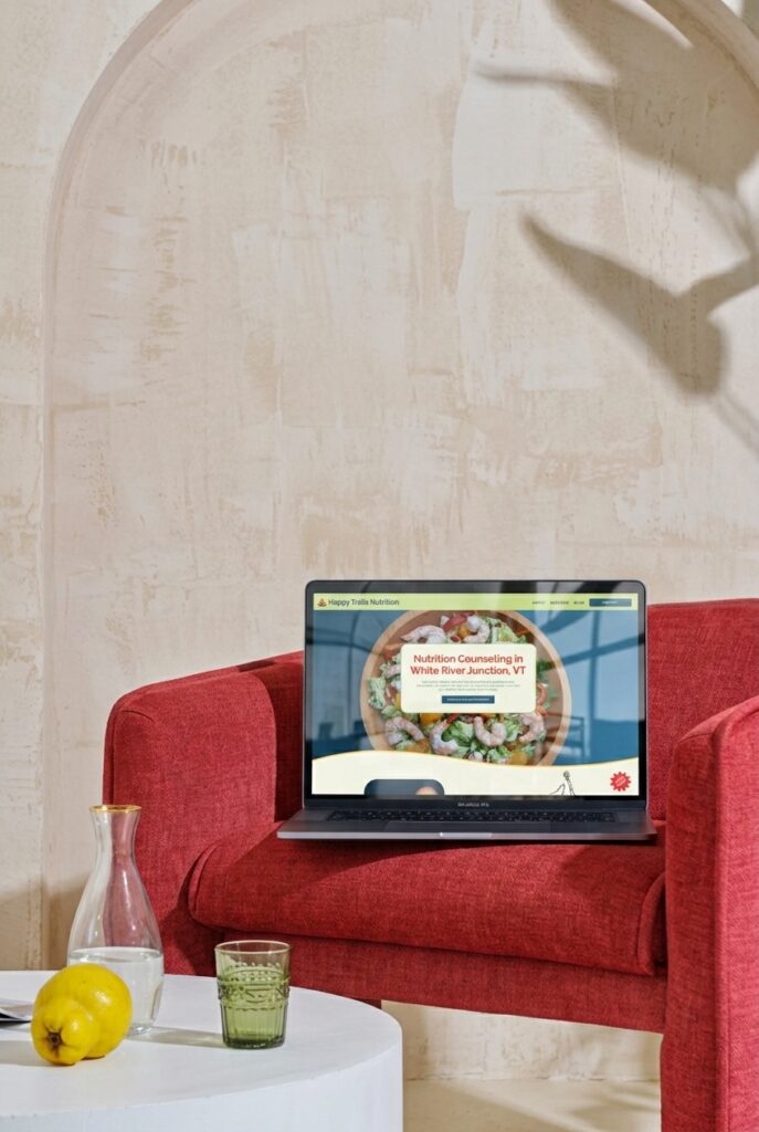
Letting Happy Trails Have Some Fun
The design itself needed to feel like Happy Trails.
I intentionally moved away from the typical polished-but-generic healthcare aesthetic and leaned into the personality behind the practice. Jen’s photography became a major part of the visual experience, bringing color, energy, and a much more personal feel to the site.
The result is a website that feels professional without feeling stuffy.
It still communicates expertise and builds trust, but there is personality throughout the experience. Visitors get a sense that there are actual people behind the practice, not just another nutrition website filled with stock photos and clinical language.
Designing the Path From Discovery to Booking
The website wasn’t just a visual refresh. It was also designed to make the entire client journey easier.
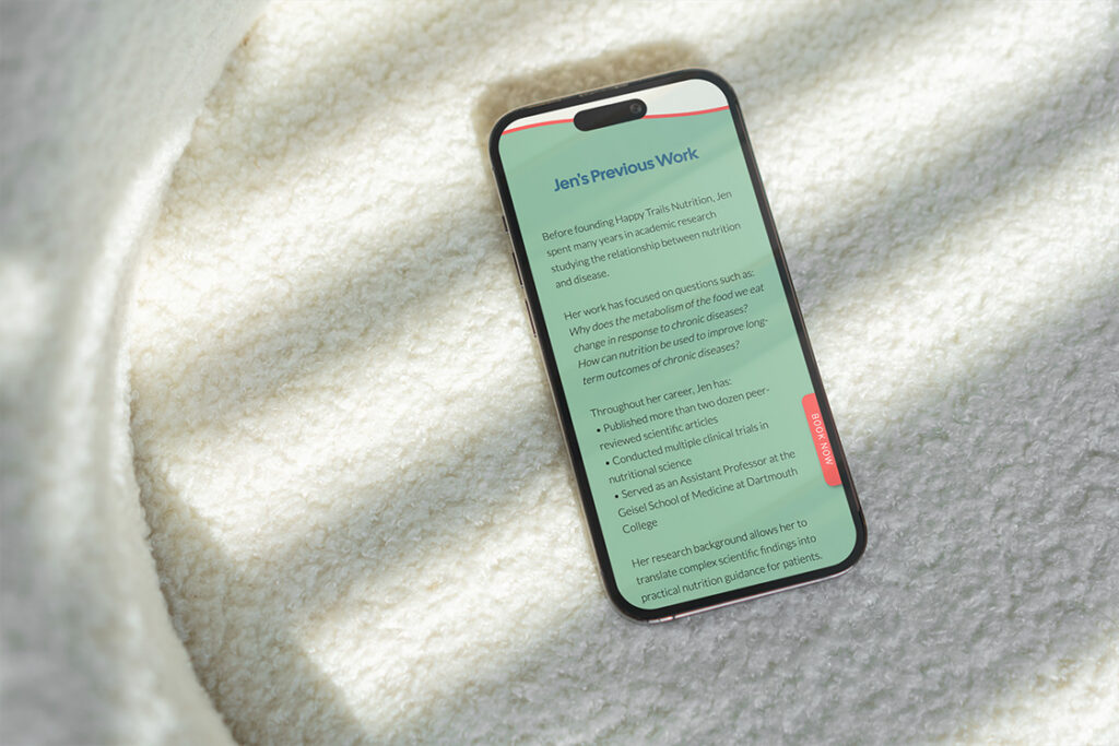
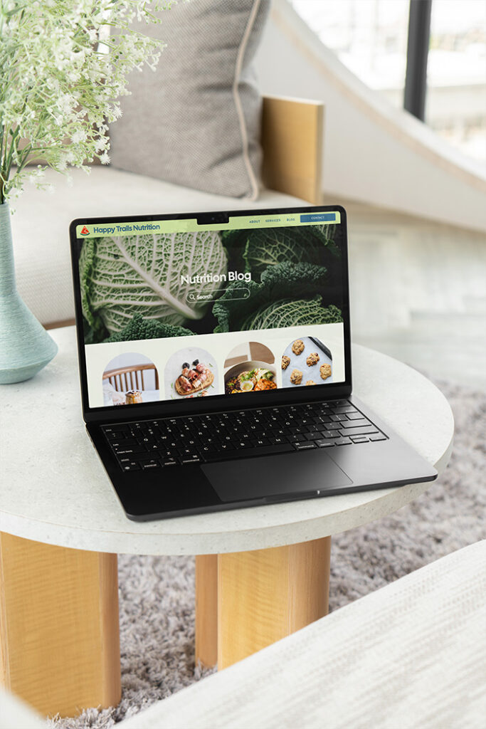
Content was simplified and reorganized so visitors can quickly understand Happy Trails’ services and what they should do next. A persistent Book Now button across desktop and mobile gives visitors a clear way to schedule no matter where they are on the site.
I also implemented structured data across key pages, including local business schema and targeted markup for the Insurance page, along with strategic SEO improvements throughout the site.
The finished website brings together the personality of Happy Trails with the clarity potential clients need when deciding whether to reach out.
A Website That Made a Measurable Difference
One of the most exciting parts of this project came after launch.
Jen shared that within a month, she had doubled the number of new patients who found her business through her website, a 100% increase.
A website is never the only factor that influences new patient growth, but it was exciting to see such a noticeable change after giving Happy Trails a clearer, more strategic online presence.
The goal wasn’t just to make the website prettier. It was to make it more useful, more memorable, and easier for the right people to take action.
What Jen Had to Say
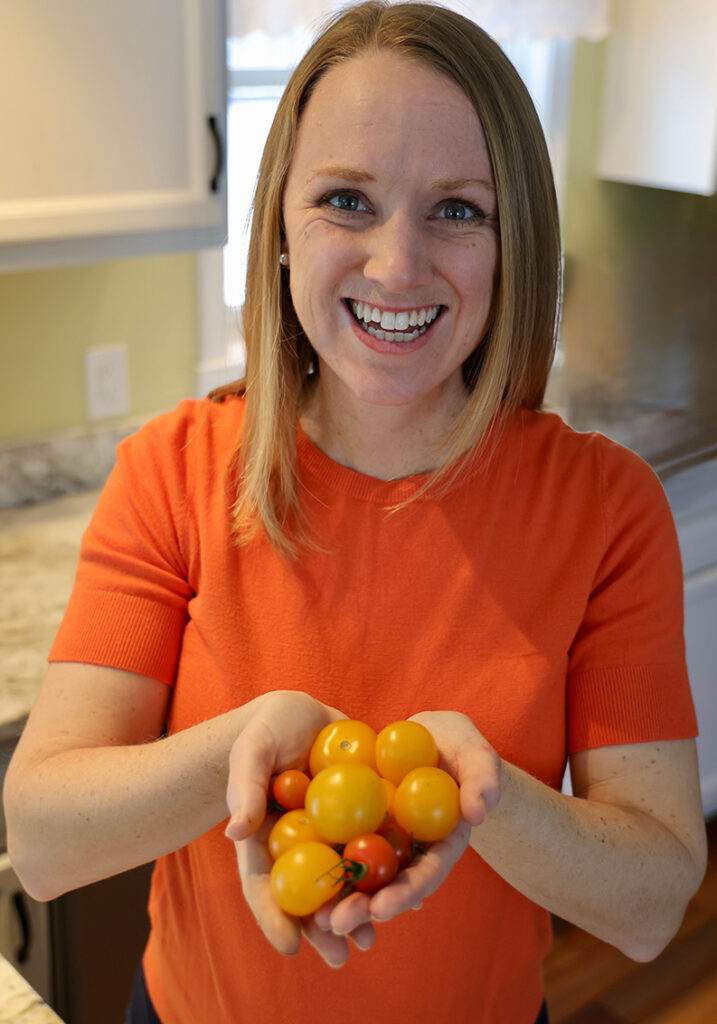
“I am so grateful for Jordin’s expertise in web design and branding! My Registered Dietitian private practice celebrated its first anniversary when I decided to invest in my website design. I decided to go with Jordin’s company, Unica Formo, because her work speaks for itself – beautiful web designs that so deeply vary, demonstrating how intentional she is to each client’s requests. She is not creating an AI generated website. It is custom and perfectly tailored to your company.
The process is about ~6 weeks long and does require the client to set aside time to devote to working with her in the design. Jordin makes the process streamlined, with branding exercises and an easy to use portal. Throughout the process, contact with Jordin is easy and rapid, often within the hour. And as a result in the past month, I have doubled (100% increase!) my new patients who have found my business through my website! Jordin prioritizes SEO (search engine optimization) in her website design and most importantly, teaches you how to implement her techniques as you continue to grow your website.
Jordin does not leave you empty handed at the end of your consulting period. She provides videos and templates in addition to the option of purchasing more of her time for future needs. And most importantly, Jordin is a lovely human with a sweet family and a thriving business that she built. Cannot recommend more highly!”
-Jen M., Owner of Happy Trails Nutrition
Your Nutrition Website Should Make the Next Step Clear
Your website can be professional without feeling predictable.
I’ll help you create a custom Showit website that communicates what makes your practice different, makes important information easier to understand, and gives potential clients a clear path toward booking.
Insurance-Based Nutrition Website Design FAQ
What should an insurance-based nutrition website include?
It should make services, insurance information, and next steps easy to find. Potential clients shouldn’t have to search through multiple pages to figure out whether they can use their insurance or how to schedule.
How can a nutrition website make insurance information less confusing?
A dedicated insurance page can organize coverage details, answer common questions, and explain what potential clients may need to do before scheduling. Clear headings and straightforward language can make the process much easier to navigate.
Can a nutritionist website have personality while still feeling professional?
Absolutely! A professional website doesn’t have to feel clinical or generic. Photography, color, typography, and thoughtful content can create a distinct personality while still communicating expertise and building trust.
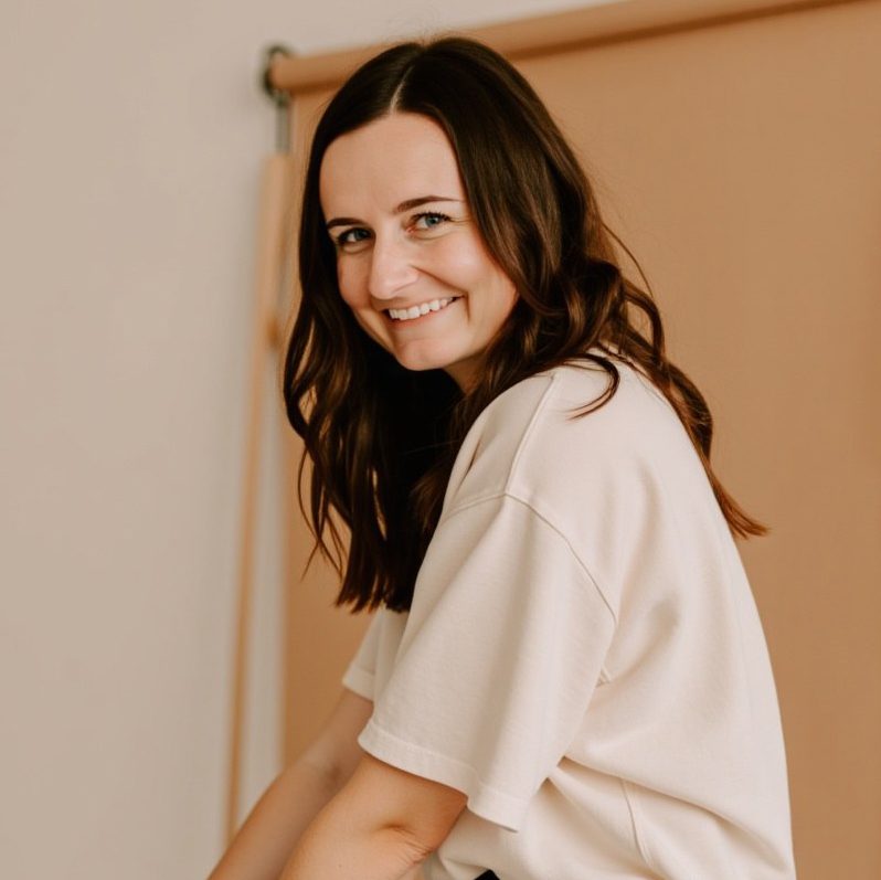
Jordin Brinn is the founder and lead designer of Unica Formo — a creative studio in Columbus, Ohio, specializing in custom Showit website design and brand strategy for service-based businesses like coaches, consultants, therapists, creatives, and wellness professionals. With over a decade of business experience, she helps clients bring strategy, clarity, and personality to their online presence.
Explore design services and free resources at unicaformo.com.


