


- 1. The Template Wasn’t Built With Strong SEO Structure
- 2. The Design Looks Good but Doesn’t Guide Decisions
- 3. Accessibility Issues Are Quietly Working Against You
- 4. Images Are Hurting Performance Instead of Helping It
- 5. The Template Doesn’t Build Trust in a Logical Way
- 6. Mobile Experience Was Treated as Secondary
- Why Showit Template Customization Matters
- Frequently Asked Questions
If your Showit website template is not converting, you’re not alone. Many people purchase a template, launch their site, and then wonder why inquiries are slow (or nonexistent).
I’ve worked with numerous clients who tried to customize their Showit templates themselves, only to feel frustrated when the site didn’t perform as they expected. The truth is, most Showit templates are designed to look good in a demo, but that doesn’t always translate to real-world conversions or strong search performance.
That doesn’t mean templates are bad — they’re a starting point, not a finished strategy. With the right customization and attention to SEO, accessibility, mobile design, and user experience, a Showit website template can absolutely convert.
In this post, we’ll walk through the most common reasons a Showit website template isn’t converting, how these issues show up in real life, and exactly what you can do to fix them.
1. The Template Wasn’t Built With Strong SEO Structure
One of the most common reasons a Showit website template is not converting is that it wasn’t built with strong on-page SEO in mind. Not all Showit templates are created equally, especially when it comes to structure and crawlability.
Many templates prioritize visual design over structural clarity, which can lead to issues like:
- Headings that are styled text boxes instead of proper H1–H3 tags
- Multiple H1s on a single page or no true H1 at all
- Important copy placed in design-heavy sections that Google struggles to understand
If Google can’t clearly interpret what your page is about, it won’t rank it. And if the right people aren’t finding your site in the first place, conversion simply can’t happen.
This is why I recommend starting with Showit templates I’ve personally vetted or from creators I trust, like Tonic Site Shop, Superhero Design, and Northfolk Co. That said, there are thousands of Showit designers creating high-quality, SEO-conscious templates at a wide range of price points. It’s absolutely worth shopping around. A solid template doesn’t have to be the most expensive one; it just needs to be built with care. (And yes, creating these myself is very much on my radar. We’ll see if I can get my life together this year and start a template shop) Even strong templates still require customization, but starting with a solid foundation matters.
How to fix it:
Make sure important copy lives in readable, crawlable sections: Use enough white space, set a comfortable line height, and choose a font size that’s easy to read. Anything under 14px is often too small for accessibility and usability. Slightly larger text may feel less aesthetic at first, but it’s better for Google, accessibility, and your audience overall.
Check your heading order on every page: Each page should have one clear H1 at the top that describes what the page is about, followed by H2s and H3s in logical order. In Showit, text styles like “Title” are often automatically assigned heading tags (usually H1). If a template creator didn’t manually adjust those settings, you may have multiple H1s without realizing it—a major SEO issue. A free Chrome extension like the Ahrefs SEO Toolbar can help you check.
Related : Header Hierarchy in Showit: How to Use Text Tags for SEO
Choose one primary keyword or key phrase per page: Tools like Ubersuggest or Answer the Public help you see what competitors are targeting and, more importantly, what real people are searching for.
2. The Design Looks Good but Doesn’t Guide Decisions
One of the biggest strengths of Showit is also one of the most common conversion pitfalls.
Because Showit is essentially limitless in its design capabilities, you can make every single section of your website look incredible down to the tiniest detail. And honestly, that’s what sets Showit apart from so many other website builders. The creative freedom is unmatched.
The problem is that when everything looks visually stimulating and beautifully designed, nothing actually stands out.
Many Showit website templates end up in this place where every section feels like it deserves equal attention. Centered text is used throughout, headline and body copy are similar in size, and background treatments stay consistent from the hero section all the way through testimonials and contact sections. The cohesiveness is excellent. But from a conversion standpoint, it can blur the hierarchy.
On most websites, not all sections carry the same weight. Your hero section, your core value proposition, and your primary call to action should visually lead the experience. If everything looks equally important, visitors are left to figure out what matters most on their own, which often leads to hesitation or decision fatigue.
This shows up most clearly with calls to action. If a CTA blends into the surrounding section or looks just like the one above it, users may scroll right past it. People subconsciously expect certain patterns, like being able to scroll and quickly spot a clear next step. When that pattern isn’t obvious, potential clients drop off.
Clear language matters here too. A button labeled “Let’s get started” might feel friendly, but it doesn’t tell the user what will actually happen next. Will it open an email? Go to a contact page? Start a booking process? Ambiguity creates friction, even when the design is beautiful.
How to fix it:
- Create stronger contrast between headlines, body copy, and calls to action. Headlines should clearly read as headlines, body copy should be easy to scan, and CTAs should look unmistakably clickable.
- Use layout changes to emphasize key sections. Break up long stretches of identical spacing, backgrounds, or visual treatments so each section can be processed individually. Not everything needs the same level of visual intensity.
- Limit competing calls to action on individual pages. Repeating one clear CTA, like “Book a consultation,” is far more effective than rotating through vague or playful variations that leave users guessing what happens next.
3. Accessibility Issues Are Quietly Working Against You
Most Showit website templates aren’t designed with accessibility in mind, even when they’re visually stunning. This is often overlooked, but it has a huge impact on usability, engagement, and conversion.
You can check your accessibility rating using free tools like PageSpeed Insights or WAVE Web Accessibility Tool. They’ll highlight issues such as low color contrast, small font sizes, or text that is too close together.
Common issues include:
- Low contrast text. Light beige on off-white or white text on near-white backgrounds may look subtle, but many visitors won’t be able to read it.
- Text over busy images. Showit allows creative overlays, but important content like CTAs or service details must sit on backgrounds that are easy to read.
- Font sizes that are too small. Anything under 14px is usually too small for accessibility and usability. Larger text ensures all users can read comfortably.
When users have to work to read your site, they won’t stay. And Google may struggle too — sites that don’t meet accessibility standards can be harder for search engines to index and prioritize.
Accessibility directly affects usability, engagement, and conversion.
How to fix it:
- Increase color contrast across your site. Use free tools like WebAIM Contrast Checker to ensure readability.
- Avoid placing important text directly over images. Decorative text over images is fine, but service details, CTAs, and critical copy should be on solid backgrounds.
- Use readable font sizes and weights. Prioritize accessibility over aesthetics when it comes to body text and headings.
4. Images Are Hurting Performance Instead of Helping It
Images are a huge factor in both user experience and site performance. Oversized images, irrelevant stock photos, or too many visual elements can slow your site and confuse visitors.
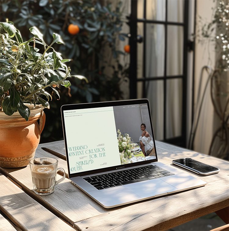
Many Showit templates come with stock images. Some are fine to use, some are not. But if the images don’t represent your services or your business, it’s time to swap them out. Using branding or personal photos — images of you working, interacting with clients, or performing your service — is one of the most effective ways to set yourself apart. Personalized photos build trust and help visitors connect with you as the expert.
Slow load times frustrate users and negatively affect SEO. Stock images or decorative visuals that don’t support your message can confuse visitors rather than engage them.
How to fix it:
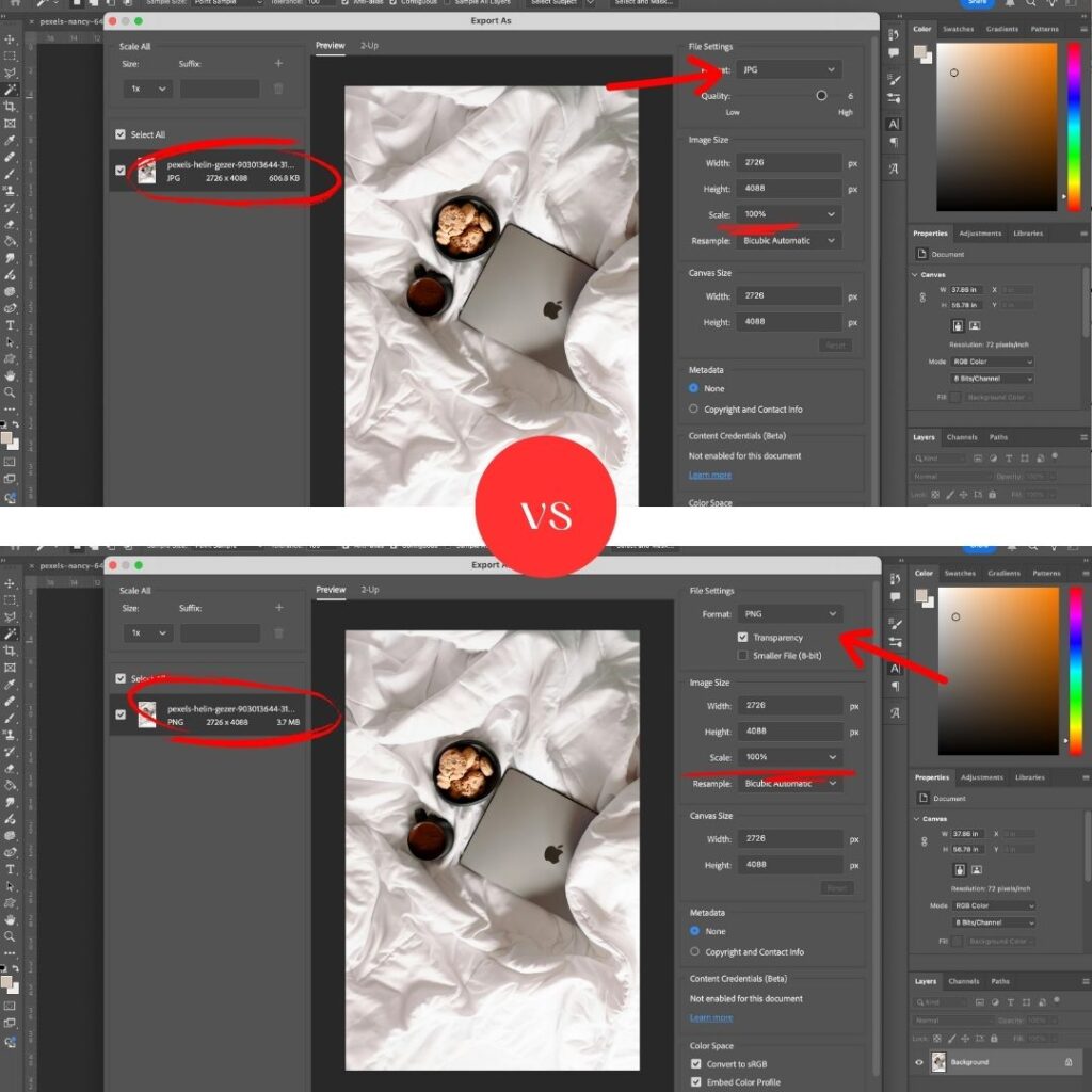
- Resize and compress images before uploading. For images that aren’t full-background width, aim for around 250KB. For backgrounds, up to 500–550KB is acceptable. Avoid overloading pages with too many large images.
Related: The Ultimate Guide to Optimize Images for Showit: Boost Speed, SEO & Rankings - Batch compress for efficiency. Free tools like Affinity allow you to compress multiple images quickly, saving time and improving performance.
- Choose images that reinforce your services and values. Replace irrelevant stock photos with images of you in action whenever possible.
- Balance visual interest with performance. Even with many images and videos, your site can remain fast. Check each page’s load time with PageSpeed Insights and adjust as needed. You can maintain a beautiful, rich design without sacrificing speed.
Following these steps ensures your images enhance rather than hinder your Showit website’s performance and conversion potential.
5. The Template Doesn’t Build Trust in a Logical Way
Most conversions don’t happen because someone loved your design. They happen because someone felt confident in you and your business.
Even templates from top designers, while visually stunning, may not guide visitors through a full trust-building journey. Important credibility elements — like testimonials, press features, or client logos — shouldn’t be buried at the bottom of the page. There should be a clear transition from services to credibility.
Your About page is a key component. It doesn’t need to be only about your personal life unless you’re a personal brand. Instead, it should explain:
- Who you are and how you got to where you are in your business
- Why you do what you do
- Who you help and how you help them solve their problems or achieve their goals
Adding personal flair helps visitors see you as a human, not just a CEO or service provider. Include photos of yourself, your team, or your workspace to make it feel real. This visual authenticity builds trust immediately.
Testimonials are crucial. While a dedicated testimonial page is fine, sprinkling them throughout the site reinforces credibility at every stage. Showcasing how others have trusted you and benefited from your work strengthens confidence in your services.
Finally, make sure your website clearly explains your services, the problems you solve, and the outcomes people can expect. This messaging should appear not only on your About page but also on your homepage, service pages, and wherever relevant.
Visitors need reassurance before they reach out. Guiding them through a logical, trust-building flow increases the likelihood of conversion.
6. Mobile Experience Was Treated as Secondary
Before we dive in, it’s worth saying: any good Showit website template isn’t going to fall into this trap. Most professional web designers and developers know the data — mobile traffic dominates. Globally, over 60% of web traffic comes from mobile devices, and in service-based industries, it can be 70–80% or higher. That makes it clear: the mobile experience cannot be treated as an afterthought.
If you’re purchasing a professionally done Showit template, you probably aren’t going to run into major issues. However, it’s still important to make sure your mobile site doesn’t have awkward spacing, because nothing frustrates users like endless scrolling.
Showit is amazing because it lets you completely split your desktop and mobile designs. For example, a section that’s 800 words on desktop might only take up a little space there — but on mobile, you can hide parts of it and show a condensed version of 200 words. The content is the same, the idea is the same, but mobile users aren’t forced to scroll forever.
Another common issue is hidden or overlooked calls to action. Many Showit templates have standout CTAs on desktop, but you need to make sure they’re just as visible and clickable on mobile.
How to fix it:
- Customize mobile layouts intentionally, not automatically: Don’t rely on automatic resizing. Decide what content is essential for mobile users.
- Prioritize key information higher on the page: Mobile users often skim, so make your main messages and calls to action appear quickly.
- Increase tap targets and font sizes: Tap targets are the clickable area around buttons and links. If they’re too small, users may accidentally tap something else. A good target is at least 44×44 pixels, and body text should be 14px or larger to remain readable.
- Adjust spacing thoughtfully: Ensure sections have enough breathing room so the page doesn’t feel cramped or overwhelming. Proper spacing improves readability and keeps users engaged.
When you design for mobile with intention, your site becomes easier to navigate, keeps visitors engaged, and increases the likelihood that they’ll take action.
Why Showit Template Customization Matters
The Showit website template is a tool, not a strategy. Templates are designed to be flexible, but flexibility requires intentional customization and structure. When accessibility, SEO, and user behavior are taken into account, a Showit website template can absolutely convert.
If your site looks good but isn’t getting inquiries, it’s usually not because Showit doesn’t work. It’s because the template was never meant to function as a finished product without refinement.
That’s why it’s important to make sure the website designer you hire to customize your template is vetted and knows all of these principles. If you’re doing it yourself, you need to touch base with all of these areas: mobile usability, SEO, conversion-focused layout, accessibility, and performance. Templates aren’t created equally—purchasing one from a reputable Showit design partner is often worth it. A template from a random Etsy seller or unknown creator can actually add more work, and in some cases, it takes more time to fix a poorly built template than to create a site from scratch.
Final thought: if you’re not sure where your Showit website template is falling short, a focused audit can reveal exactly what’s working, what’s holding you back, and what to prioritize first. Conversion isn’t about making your site louder or trendier — it’s about making it clearer, more usable, and aligned with how real people and search engines behave.
Related: How to Audit Your Website Yourself
If you’re ready to take the stress out of template customization and turn your Showit website into a site that actually converts, I offer a full [Showit Template Customization Service] that handles everything from layout and mobile optimization to SEO and user experience.
Frequently Asked Questions
Can I make a Showit template convert without hiring a designer?
Yes, but it requires careful attention to SEO, mobile layout, accessibility, and user behavior. Many template buyers underestimate the work involved in making a template truly functional.
Are all Showit templates created equally?
No. Some templates look beautiful in the demo but lack strong SEO structure, mobile usability, or conversion-focused layout. Buying from a vetted Showit designer or design partner can save you time and frustration.
How do I know if my Showit template needs customization?
If your site looks good but isn’t generating inquiries, leads, or sales, it’s a sign that key elements like calls to action, mobile design, SEO, or accessibility may need work. A focused audit can pinpoint exactly what to fix.
What is a “tap target” and why does it matter?
A tap target is the clickable area around buttons and links on mobile devices. If it’s too small, users may tap the wrong thing, which leads to frustration and lower conversion. A good tap target is at least 44×44 pixels.
Can I use a template from Etsy or other marketplaces?
Yes, but be cautious. Many of these templates aren’t built with SEO, mobile usability, or conversion in mind. Often, customizing them takes more time than starting with a professionally built Showit template.
How can a Showit template audit help me?
An audit will show you what’s working, what’s holding back, and what to prioritize first. It helps you make your site more usable, readable, and aligned with both real user behavior and search engine best practices.
Pin for Later:

Jordin Brinn is the founder and lead designer of Unica Formo — a creative studio in Columbus, Ohio, specializing in custom Showit website design and brand strategy for service-based businesses like coaches, consultants, therapists, creatives, and wellness professionals. With over a decade of business experience, she helps clients bring strategy, clarity, and personality to their online presence.
Explore design services and free resources at unicaformo.com.


