


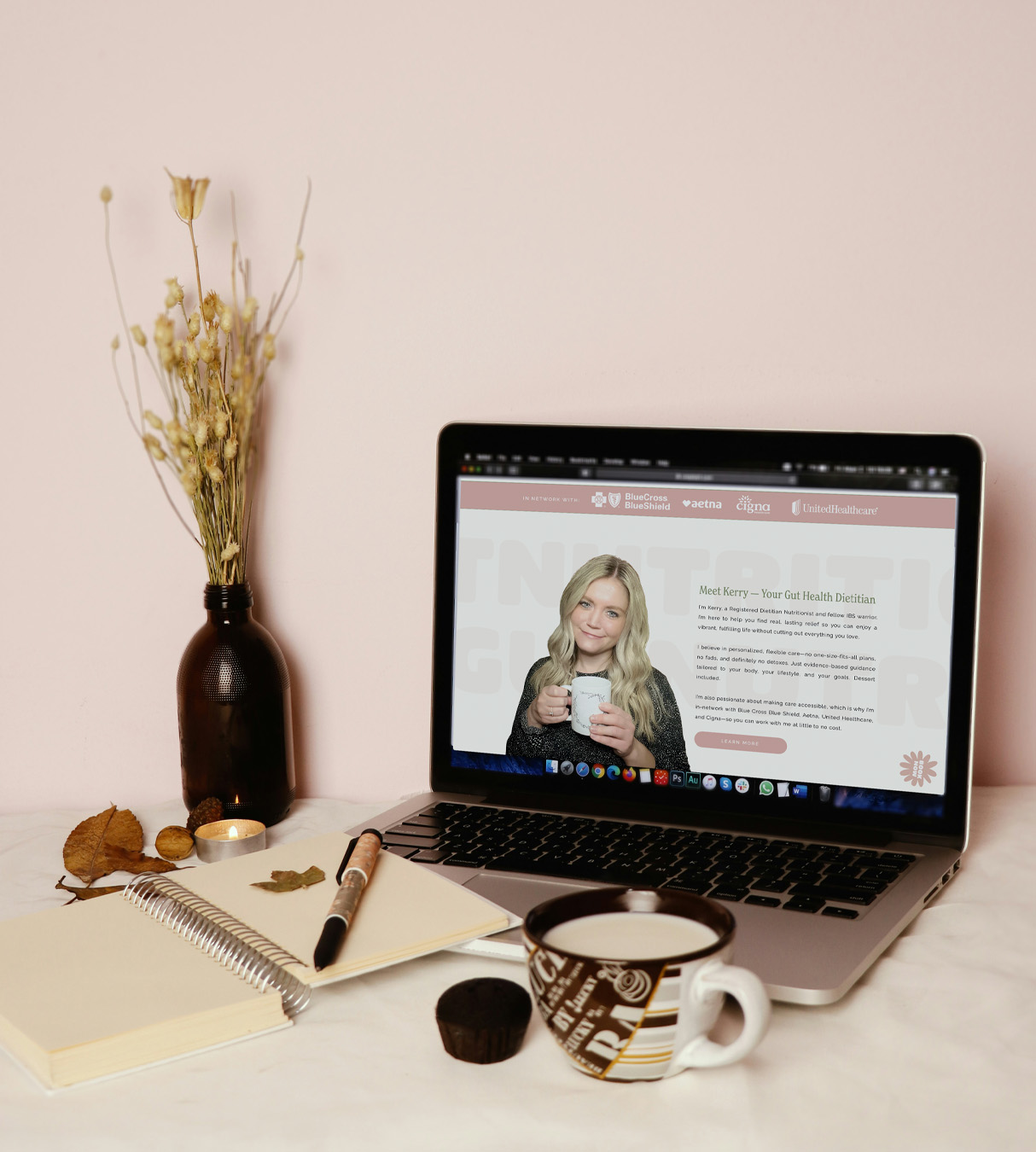
- Good Gut Nutritionist | Gut Health Dietitian Website Design
- The Challenge
- Creating a Gut Health Dietitian Website That Feels Like Kerry
- Designing Around the Client Journey
- A Website That Finally Felt Like Her
- What Kerry Had to Say
- Your Expertise Deserves a Website That Reflects It
- Gut Health Dietitian Website Design FAQ
Good Gut Nutritionist | Gut Health Dietitian Website Design
The Scope: Custom Showit Web Design & VIP Day(s)
The Vibes: Light, approachable, uplifting
The Industry: Nutrition & Gut Health
When Kerry came to me with her self-made Wix website, she knew she wanted something that felt more like her practice. The goal of this gut health dietitian website design was to create a welcoming online home for Good Gut Nutritionist that communicated her expertise without feeling clinical or overwhelming.
Kerry helps clients navigate digestive issues including IBS, SIBO, bloating, constipation, abdominal pain, and food anxiety. Her approach is evidence-based but flexible, helping clients improve their gut health without feeling like they have to give up everything they love.
The Challenge
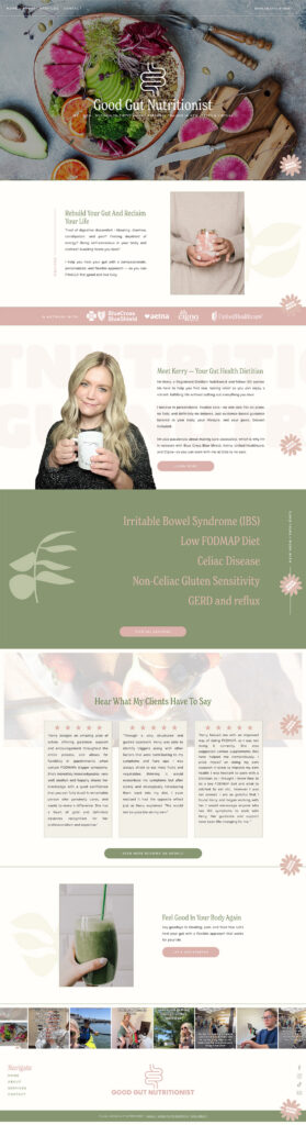
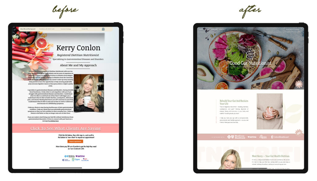
Kerry’s previous website was functional but very bare bones. She wanted to elevate her online presence and create something that better reflected her expertise and the experience she wanted clients to have.
The tricky part? Kerry knew she wanted the site to feel like her, but she wasn’t totally sure what that looked like yet. As she put it, she had serious decision fatigue trying to figure out which colors and shades were actually “her.”
The new website needed to make her services, expertise, insurance information, and client experience easier to understand while creating a space that felt supportive rather than clinical.
Creating a Gut Health Dietitian Website That Feels Like Kerry
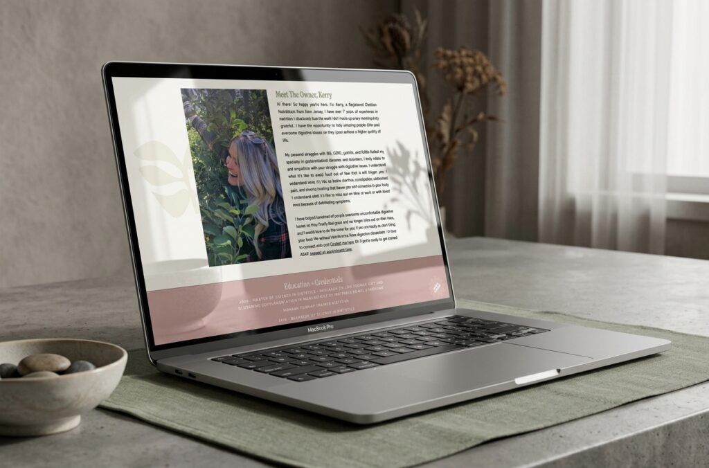
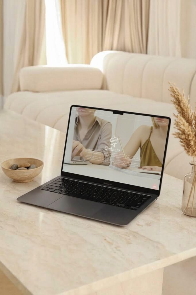
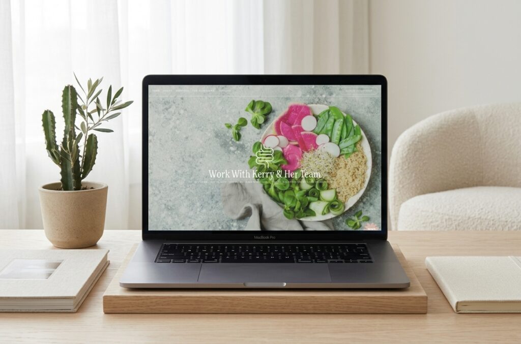
For the visual direction, I wanted the gut health dietitian website design to feel light, organized, and uplifting while giving Kerry’s personality plenty of room to come through.
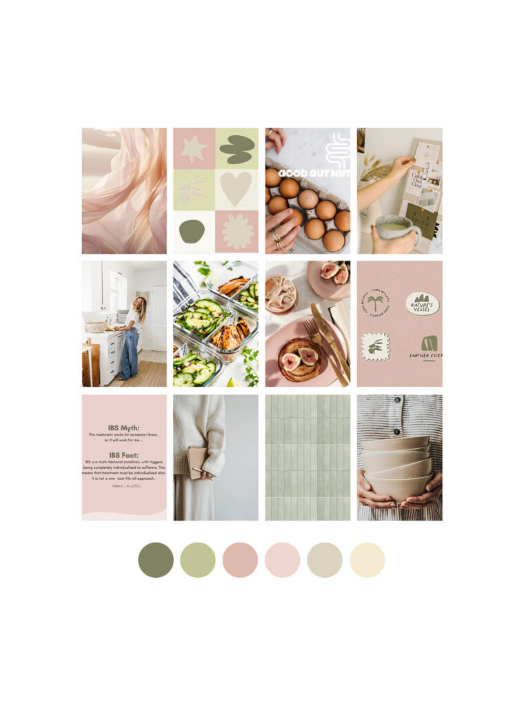
Kerry shared a collection of Pinterest inspiration, which gave me a starting point for identifying the colors, typography, and overall feeling she was drawn to. From there, I created a homepage draft so she could see the aesthetic come together before we built out the rest of the website.
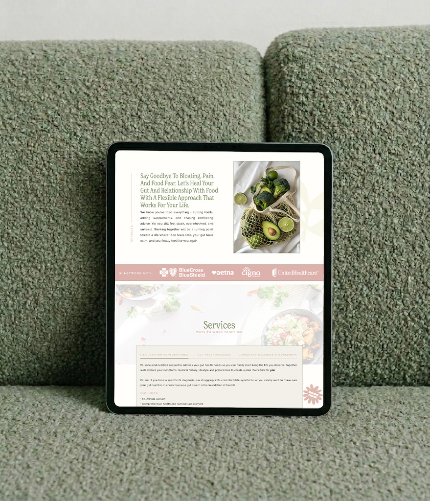
The final direction combines light neutrals with playful pops of color, clean typography, thoughtful spacing, and feminine-leaning details. It feels polished and professional without becoming overly clinical or generic.
Designing Around the Client Journey
There was also plenty of practical information to organize. Visitors needed to understand what Kerry specializes in, who she works with, what services are available, whether insurance could be used, and how to request an appointment.
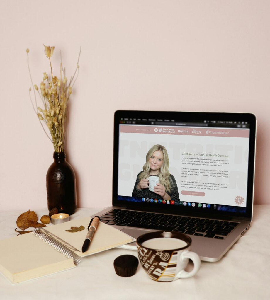
I structured the site so those details were easy to find without taking away from the personality of the design. Prominent insurance information gives potential clients an immediate place to start, while the appointment-request functionality makes the next step clear.
The result is a website that feels organized and professional while still having the light, approachable personality that makes Good Gut Nutritionist feel different.
A Website That Finally Felt Like Her
One of my favorite parts of this project was helping Kerry find a visual direction she already knew she liked, even if she couldn’t quite put it into words yet.
She sent me her inspiration, I pulled the common threads together, and the homepage draft gave us a chance to make sure we were on the right track before moving forward.
And apparently, we nailed it.

What Kerry Had to Say
“Before working with Jordin, I had a self-made website that was totally bare bones. I really wanted to elevate my website in a way that captured my brand and aesthetic. The problem was I didn’t even know what my aesthetic was lol. I had decision fatigue trying to decide which colors and shades were “me.” Jordin made this part so easy for me. I put a collection of photos on a Pinterest board and she knew from there exactly what I was going for, when I wasn’t even sure what I was going for. From there she put together a rough draft of a homepage to see if the aesthetic was what I had in mind, and it was absolutely perfect. I was so happy and so relieved that she captured it so well.
I initially chose Jordin because I loved the work she had in her portfolio. But other than that, we had a discovery call and I loved her personality. She asked all the right questions and showed genuine interest in my vision. She also didn’t exert any pressure on me to choose her. One thing that is a massive deterrent for me is being salesy and Jordin was not salesy at all. She was genuine and would be happy to help me, but didn’t make me feel pressure to sign a contract and move forward. In fact, I think it took me a few months to circle back to her and sign a contract.
Jordin was serenely communicative and transparent from start to finish. Very organized. To be completely honest, I wasn’t as “on top of things” as I should’ve been because I was so busy, but Jordin would gently check in every few days, send updates, and was patient with me in my delayed responses.
The final product far exceeded my expectations. I am in love with my site. Sometimes i just visit it myself to look at it lol. If you are looking for a genuine, kind, organized, and patient person to build your site and capture your vision, Jordin is your girl!”
-Kerry C., Owner of Good Gut Nutritionist
Your Expertise Deserves a Website That Reflects It
If you specialize in gut health, digestive issues, or helping clients rebuild their relationship with food, your website should make that expertise clear without losing the personality behind your practice.
I’ll help you create a custom Showit website that communicates what makes your approach different, guides potential clients through your services, and feels like your practice from the first click.
Gut Health Dietitian Website Design FAQ
What should a gut health dietitian website include?
A gut health dietitian website should clearly explain your specialties, services, approach, and how potential clients can get started. If you accept insurance, that information should also be easy to find.
How can a nutrition website feel professional without feeling clinical?
Thoughtful typography, color, photography, spacing, and messaging can create a polished experience without making the website feel sterile. For Good Gut Nutritionist, I used light neutrals and playful color to keep the site professional while still reflecting Kerry’s personality.
Can my website help potential clients feel more comfortable reaching out?
Totally! Your website is often one of the first places someone gets a sense of what it will be like to work with you. Clear messaging, approachable visuals, testimonials, and an easy-to-follow booking process can all help remove some of the uncertainty before someone reaches out.
What makes custom Showit website design different from a template?
A custom Showit website is designed around your specific business, audience, services, and visual direction rather than adapting your content to a predetermined layout. That gives you more flexibility to create an experience that actually feels like your practice.

Jordin Brinn is the founder and lead designer of Unica Formo — a creative studio in Columbus, Ohio, specializing in custom Showit website design and brand strategy for service-based businesses like coaches, consultants, therapists, creatives, and wellness professionals. With over a decade of business experience, she helps clients bring strategy, clarity, and personality to their online presence.
Explore design services and free resources at unicaformo.com.


