


Conversion focused website design is what separates a website that simply looks good from one that actively brings in clients.
A pretty website that doesn’t convert is just decoration. And while aesthetics matter, your site also needs to function as a strategic marketing tool that supports your business growth.
Because here’s the truth: if your website is slow, confusing, or unclear, people will leave. But if it’s built with intention, it becomes one of your most powerful assets for attracting and converting clients.
That’s where strategy comes in.
As a website designer, I focus on combining strong visual branding with conversion focused website design principles—so your site doesn’t just represent your business, it actively works for it. This is something I implement across my Showit website design projects, where strategy and aesthetics work together to support real business growth.
In this post, I’m breaking down what actually matters when it comes to building a website that converts, so you know what to prioritize in your next refresh or redesign.
A User-Friendly Experience That Keeps Visitors Engaged
If your website is confusing, slow, or difficult to navigate, people will leave and most of them won’t come back.
A conversion focused website starts with a seamless user experience. Before someone ever reads your copy or clicks your call to action, they’re subconsciously deciding whether your site feels easy to use.
That’s why clarity and simplicity matter so much.
Keep navigation simple
Your menu should be clear, intentional, and easy to move through. Avoid overwhelming dropdowns or too many competing pages.
Optimize for speed
Slow load times directly impact conversions and visibility. Compress images, reduce unnecessary design elements, and regularly test performance using tools like:
Design for mobile first behavior
More than half of website traffic comes from mobile devices. If your site doesn’t function smoothly on smaller screens, you’re likely losing potential clients before they even engage.
Pro tip:
I design every website with a user-first approach, ensuring it feels intuitive, responsive, and easy to navigate across all devices.
Clear & Strategic Calls to Action (CTAs)
Your website should always guide visitors toward a next step, whether that’s booking a consultation, inquiring about services, or joining your email list. If someone has to stop and think about what to do next, you’re already losing potential clients.
A strong conversion focused website design doesn’t rely on a single CTA in one place. It builds a system of decision points that meet users at different stages of readiness.
Make your primary CTA obvious (above the fold)
Every homepage should have a clear, visible call to action above the fold. This is often the first action-oriented moment a visitor sees, and it should require zero effort to find.
Common examples include:
- “Book Your Consultation”
- “Inquire About Working Together”
- “View Services”
This primary CTA should be repeated throughout your site, not just placed once.
Use sticky or persistent CTAs for easy access
One of the most effective (and often underused) strategies is a sticky navigation button or persistent “Book Now” element that follows the user as they scroll.
This removes friction entirely, if someone decides they’re ready at any moment, they don’t have to scroll back or search for the next step.
I often implement:
- Sticky “Book Now” buttons in the header
- Floating CTA buttons on mobile
- Repeated “Schedule Now” buttons at natural break points in the page
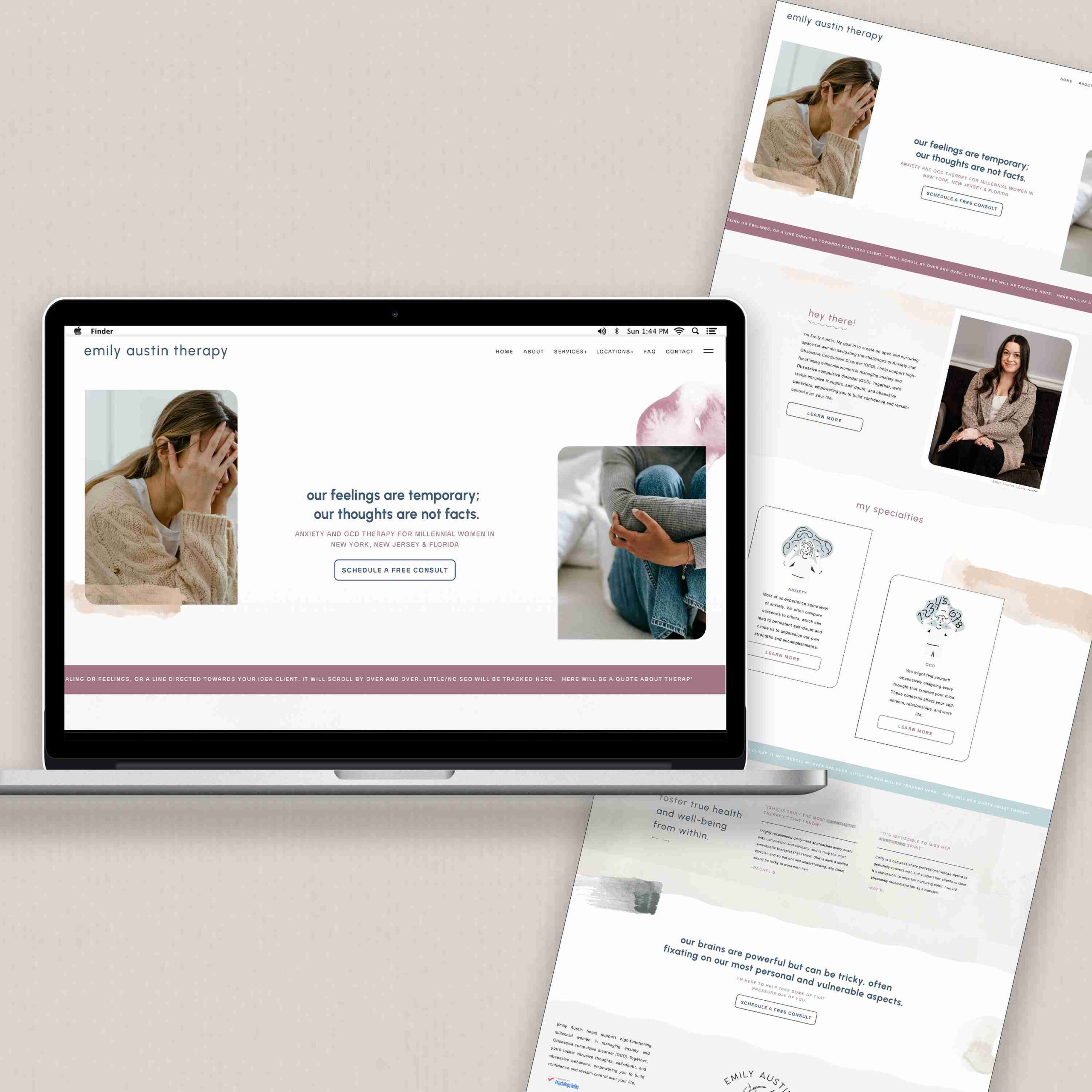
You can see a “live example” where I included this here and here.
Use secondary CTAs for warmer leads
Not every visitor is ready to book immediately. That’s where secondary CTAs come in.
These might include:
- “Learn More About Services”
- “View Client Results”
- “Explore the Process”
These allow users to stay engaged without pressure, while still moving them deeper into your ecosystem.
Match CTAs to intent (this is what most websites miss)
Different pages should have different CTAs based on user intent:
- Homepage → Book / Inquiry (high intent)
- Blog posts → Learn more / Related services (low to mid intent)
- Service pages → Book / Apply (high intent)
- About page → Connect or book (trust-building stage)
This alignment is what actually improves conversions—not just “more buttons.”
Create urgency without being pushy
Urgency doesn’t have to feel aggressive. It can be subtle and trust-based:
- Limited monthly client spots
- Booking availability windows
- “Currently accepting new clients”
Pro tip:
When I design websites, I build CTA systems, not just buttons. That means strategically placing conversion points throughout the user journey so visitors always know what their next step is, without feeling overwhelmed or pressured.
Building Trust Throughout Your Website
People don’t book services or buy from brands they don’t trust. Before someone ever reaches out, they’re quietly scanning your website for credibility, consistency, and proof that you can help them.
A conversion focused website design doesn’t treat trust as a single section, it builds it into the entire experience.
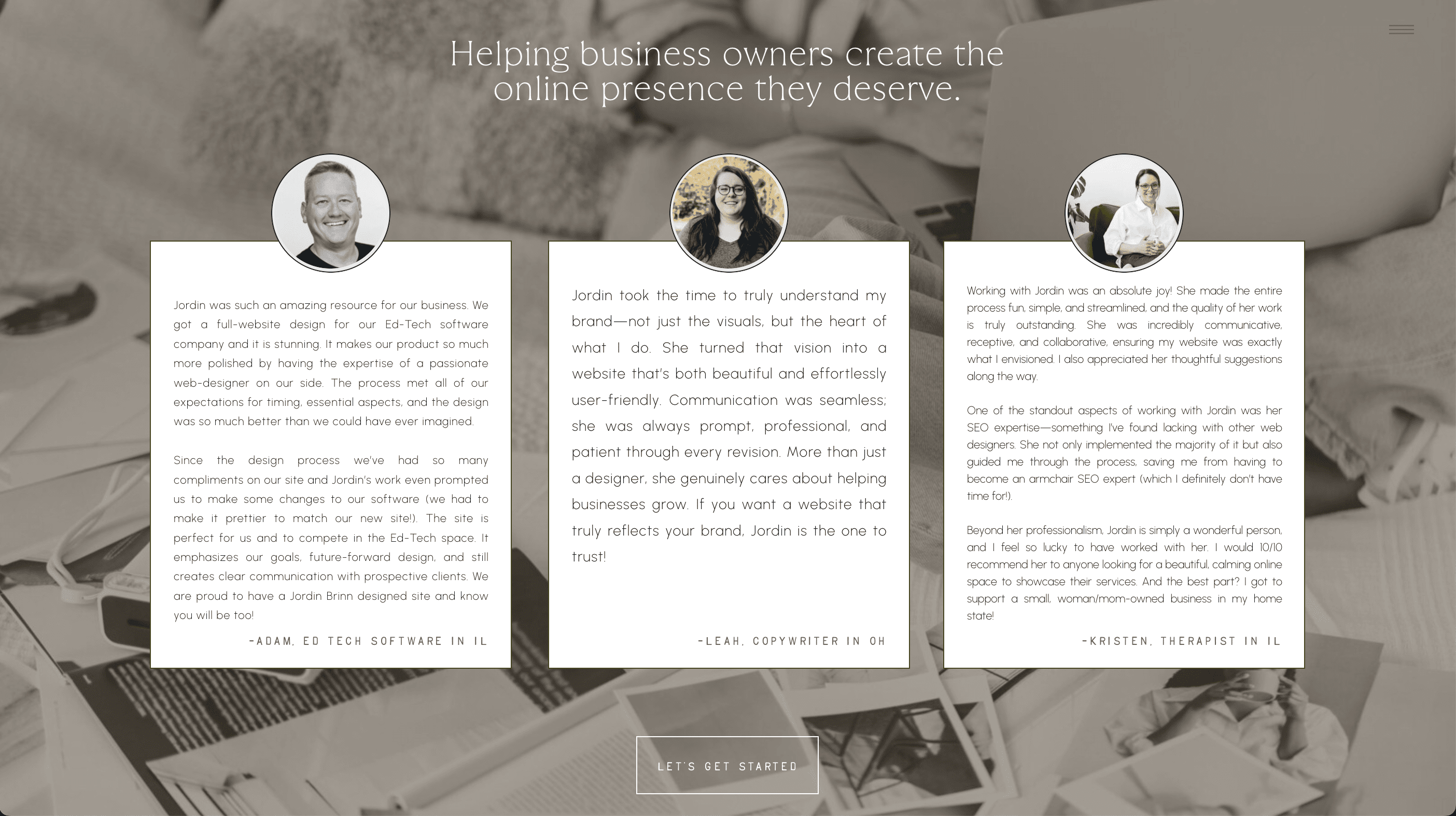
Showcase real testimonials (and place them strategically)
Testimonials shouldn’t live only on a dedicated page. They should be woven throughout your website at key decision points.
This includes:
- Near service descriptions (to reinforce value)
- Right before or after CTAs (to reduce hesitation)
- On your homepage as social proof “snippets”
The goal is simple: remove doubt before it becomes an objection. Asking for feedback can feel awkward or uncomfortable for many business owners, especially when you’re proud of the work you’ve done, but learning how to do it well can completely transform the quality of your testimonials and client trust. I actually wrote a full guide on how to make this feel easier and more natural – how to ask for client feedback.
Highlight your expertise in a way that feels relevant
Your credentials, experience, and recognition matter but they should be framed through relevance, not just listing achievements.
Instead of only saying what you’ve done, connect it to what it means for the client:
- Certifications that support your method
- Years of experience tied to results
- Press features or collaborations that build authority
This helps visitors understand why they should choose you over someone else.
Use real, high-quality imagery to build connection
People don’t connect with perfect stock imagery; they connect with real, human presence.
Professional brand photos help:
- Build familiarity and emotional trust
- Make your business feel more tangible
- Strengthen personal connection before contact
This is especially important for service-based businesses where trust is the deciding factor.
SEO & Content in a Conversion Focused Website Design
If your ideal clients can’t find you, they can’t book you. SEO (Search Engine Optimization) is what helps your website show up when people are actively searching for services like yours—and it’s a core part of a conversion focused website design that actually drives long-term visibility and inquiries.
Unlike surface-level “keyword placement,” real SEO is about structure, clarity, and how your entire website communicates relevance to search engines.
Use strategic keywords throughout your site
Choosing the right keywords is the foundation of visibility. You need to understand what your audience is actually searching for, then weave those terms naturally into your website pages and blog content.
When done correctly, keyword strategy supports a conversion focused website design by ensuring your site attracts the right visitors—not just more visitors.
Write clear and compelling meta descriptions
Meta descriptions are the short snippets that appear in search results. While they don’t directly impact rankings, they heavily influence whether someone clicks through to your site.
Think of them as your first impression in Google—an extension of your conversion focused website design strategy that starts before someone even lands on your page.
Keep your content fresh and relevant
Search engines favor websites that are active and consistently updated. This doesn’t mean constant redesigns—it means intentional updates like:
- blog posts that answer client questions
- portfolio updates that showcase real work
- refreshed service pages as your offers evolve
Consistency in content is what keeps a conversion focused website design performing long after launch.
Optimize your images for speed and SEO
Large image files can slow your website down, which negatively impacts both user experience and search rankings.
Compress images, use proper formatting, and always include descriptive alt text. This not only improves accessibility but also strengthens how search engines understand your content. I have an entire post on how to properly optimize your images that you can read here.
Your Website Should Feel Beautiful AND Perform Strategically
A well-designed website should do more than look good—it should actively support your business growth. When you combine intentional branding with a conversion focused website design, your site becomes a powerful tool that attracts the right people, builds trust, and turns visitors into paying clients.
Design absolutely matters, but so does strategy. Your website should feel aligned with your brand while also being structured to guide users toward action at every step.
That’s the balance I focus on in every project: creating websites that are visually elevated, deeply intentional, and built to convert.
If you’re ready for a website that doesn’t just sit online, but actually works for your business, I’d love to help you bring it to life.
Pin for Later:

Jordin Brinn is the founder and lead designer of Unica Formo — a creative studio in Columbus, Ohio, specializing in custom Showit website design and brand strategy for service-based businesses like coaches, consultants, therapists, creatives, and wellness professionals. With over a decade of business experience, she helps clients bring strategy, clarity, and personality to their online presence.
Explore design services and free resources at unicaformo.com.


The point about making your primary CTA obvious, above the fold, resonates with me, especially during admission season when every minute counts. In my experience, a clear call to action can increase conversion rates by up to 20%, which is substantial when you’re dealing with hundreds of potential students. I’ve also found that using real, high-quality imagery, as mentioned, can help build trust, but it’s equally important to ensure these images reflect the diversity and inclusivity of your institution. The parallel between designing for mobile first behavior and the challenges we face in reducing enrolment funnel drop-off is something I have been thinking about because many students, especially in India, primarily access our websites through their mobile devices. As someone who has run campaigns for colleges, I’m curious to see how institutions will adapt their website design to better cater to this mobile-first behavior, particularly in terms of optimizing for speed, which can be a major issue given the sometimes patchy internet connectivity in certain regions.