


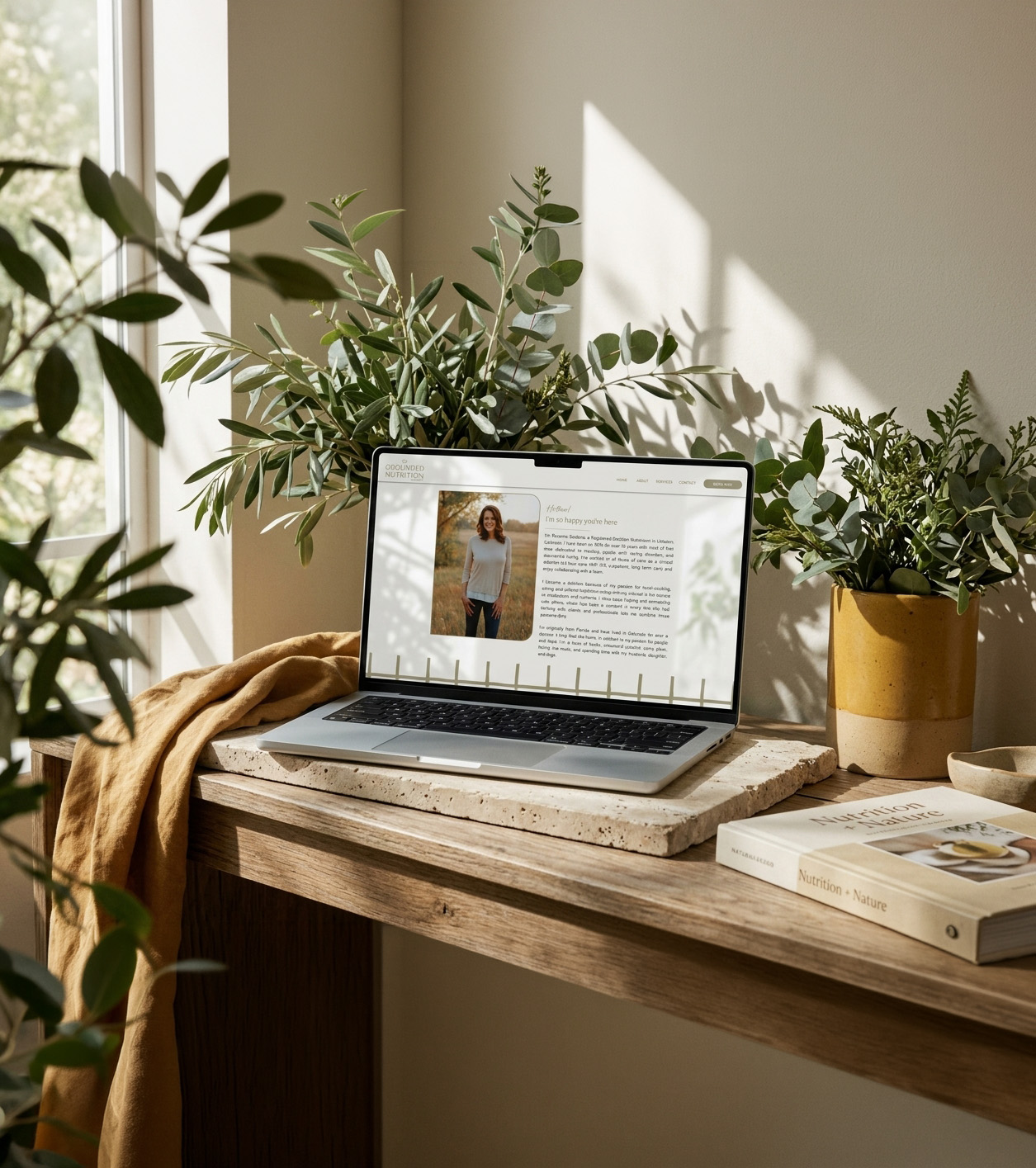
The Scope: Branding & Custom Showit Web Design
The Vibes: Earthy, Supportive, Intentional
The Industry: Nutrition & Intuitive Eating
There’s something about the Grounded Nutrition Therapy brand that feels exactly like its name.
Warm. Natural. A little unexpected.
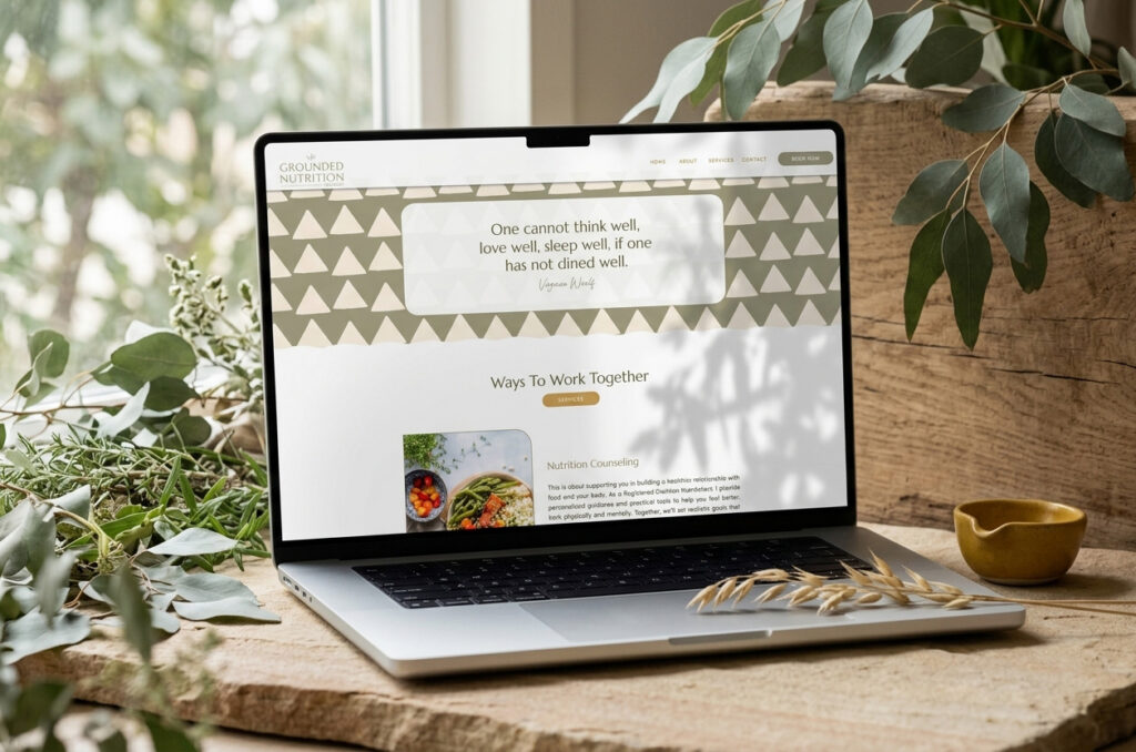
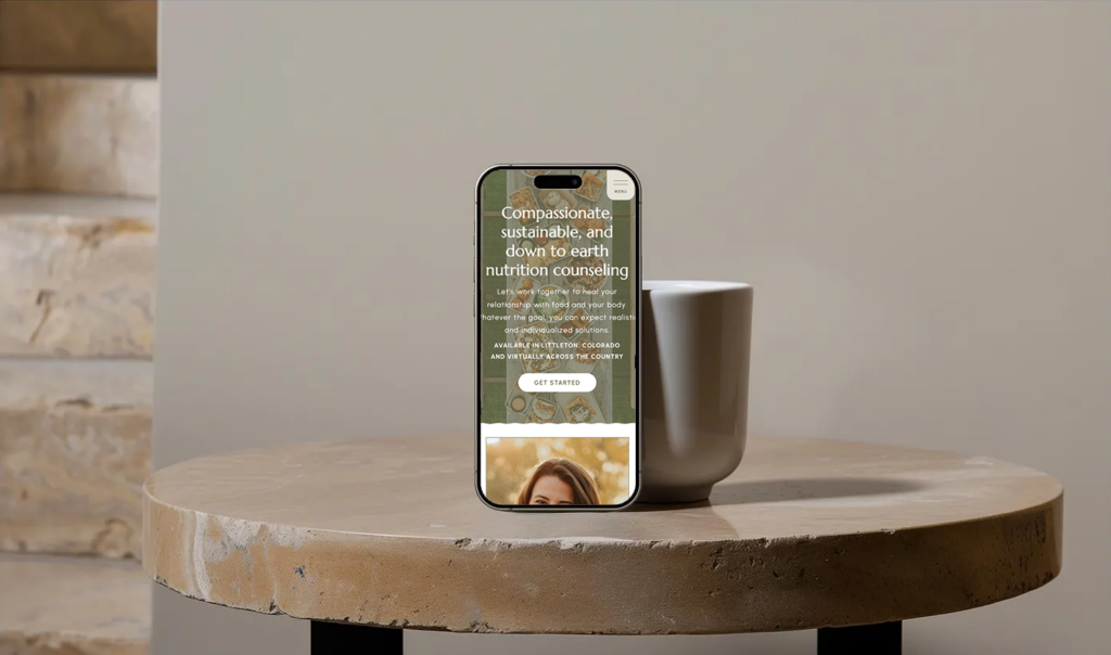
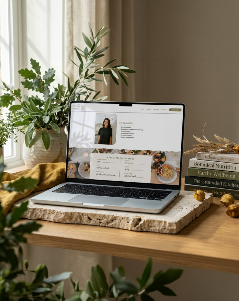
Roxanne came to me ready to move beyond the DIY website she had built years earlier and create something that felt much more representative of her practice. This earthy nutritionist website design gave us the opportunity to build that feeling from the ground up, starting with the brand and carrying it through every part of the Showit website.
The Challenge
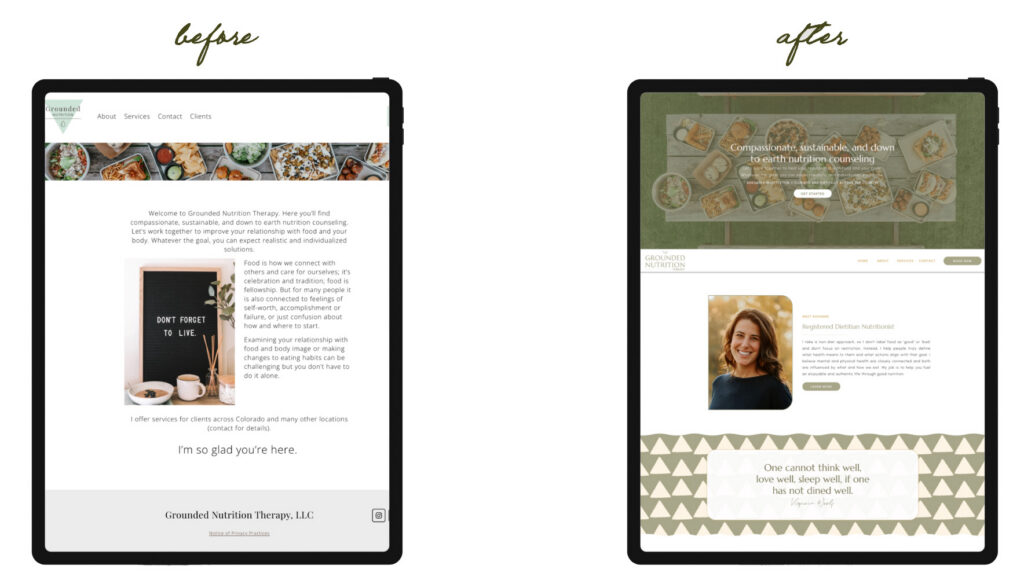
Roxanne had already built a practice centered around helping people step away from dieting and develop a more positive relationship with food. Her approach is evidence-based, but it is also personal, compassionate, and deeply human.
Her original website didn’t quite capture that.
It was functional, but the visual experience felt disconnected from the warmth of her work. After years of running her practice, Roxanne was ready for something more polished that still felt like her, rather than something that looked like a typical healthcare website.
She also had more to communicate than when she first built the site. Alongside nutrition counseling, Roxanne offers professional supervision, making it important to create a website that could showcase both sides of her work without making either feel like an afterthought.
Starting With an Earthy Brand Direction
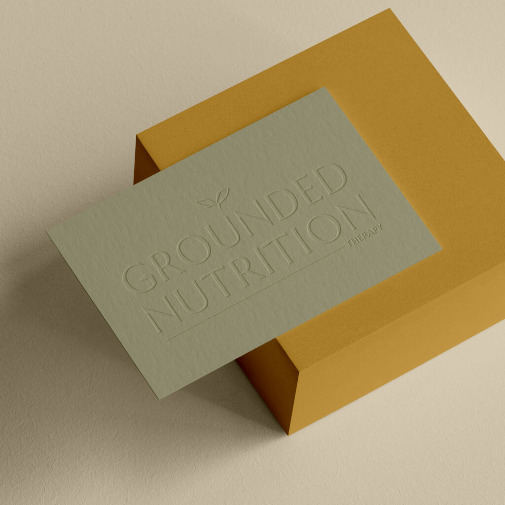
The visual direction for Grounded Nutrition Therapy started with the feeling behind the name.
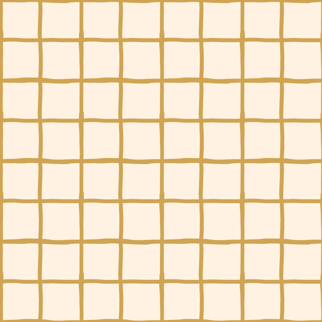
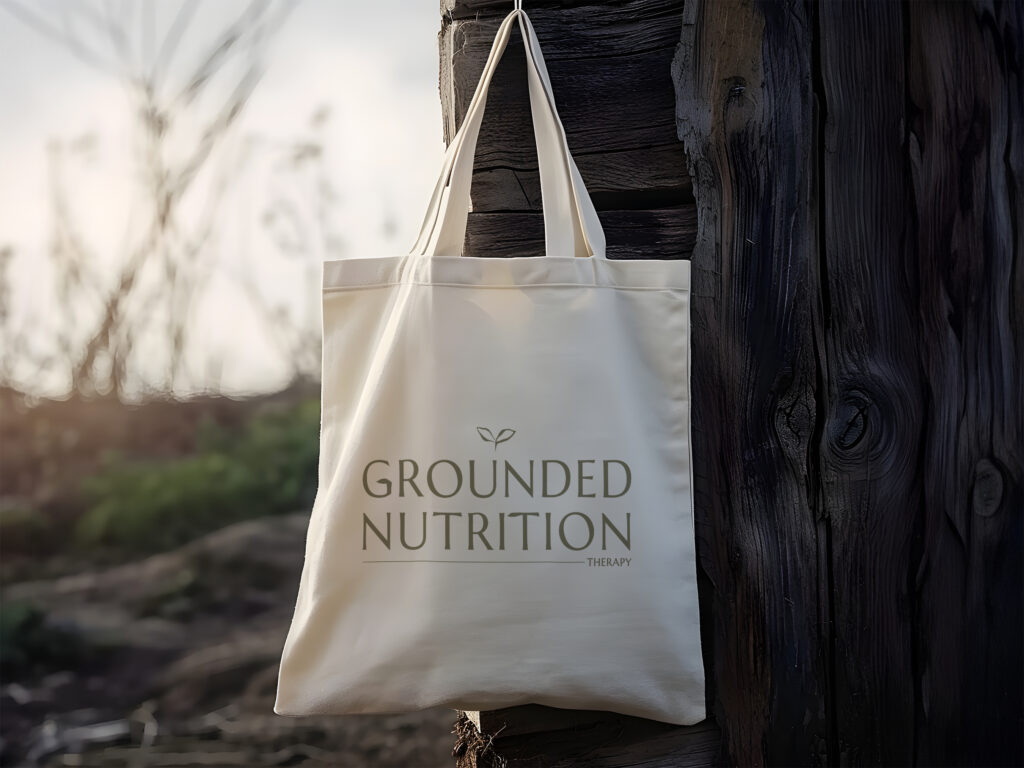
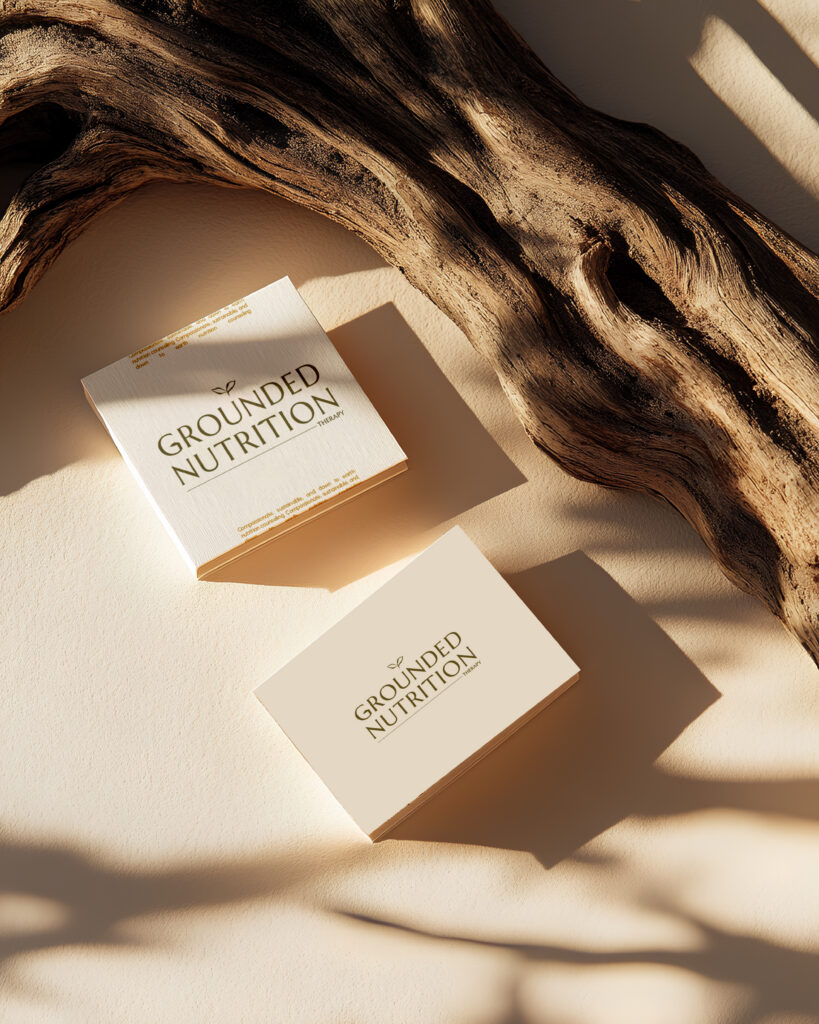
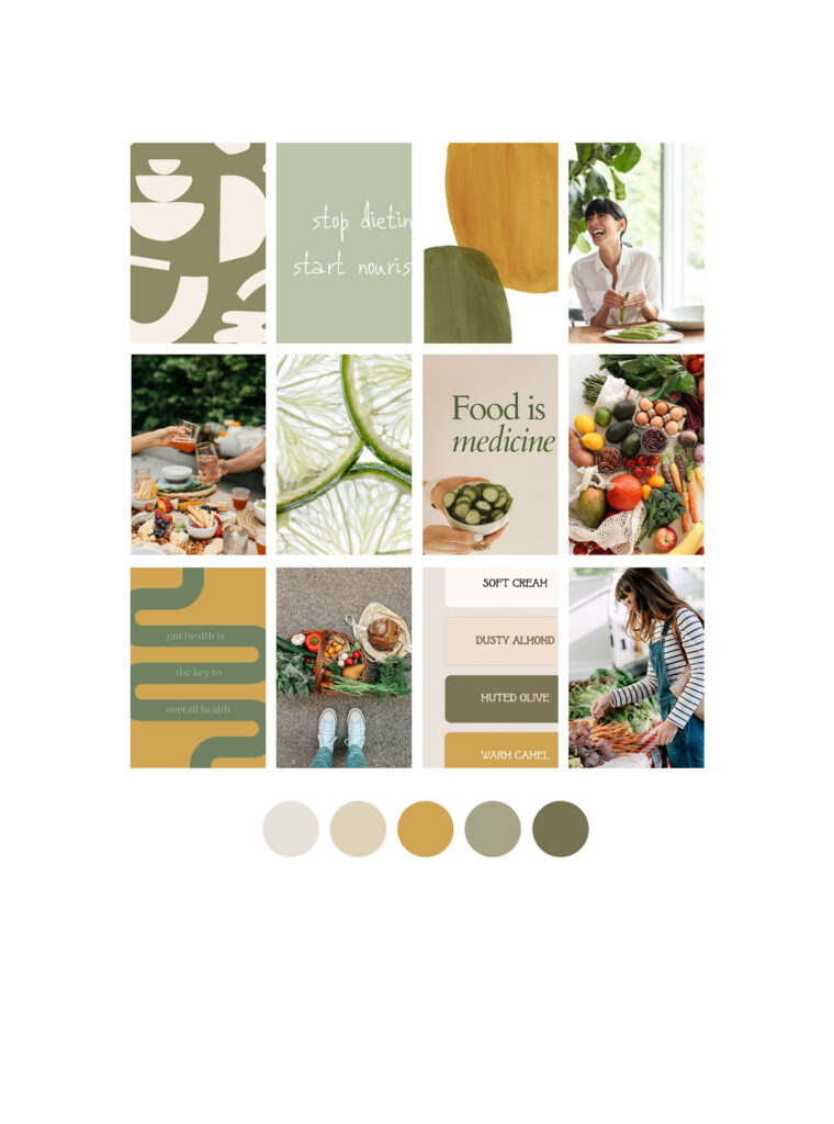
I wanted the brand to feel connected to nature without leaning too heavily into the expected “wellness” look. Instead of an overly muted palette, we brought in earthy greens, warm tans, and mustard yellow, creating something that feels grounded but still has personality.
Typography helped balance everything out.
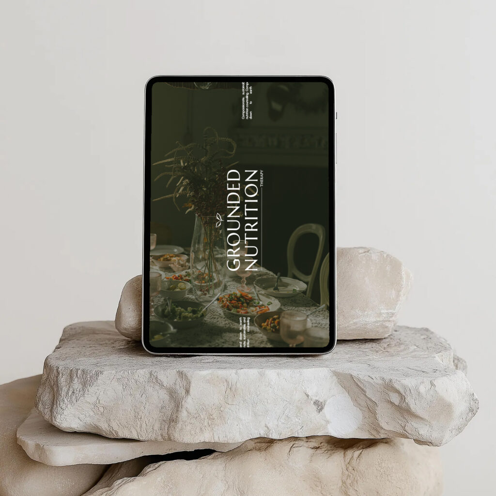
Clean, readable fonts keep the website professional and easy to use, while softer script details add a little warmth and imperfection. Food and lifestyle imagery bring another layer of texture into the design, reinforcing Roxanne’s belief that nutrition is about much more than rules or numbers.
The result feels natural without being rustic and professional without being clinical.
Carrying the Feeling Into Showit
Once the branding was established, the website became an opportunity to build an entire experience around it.
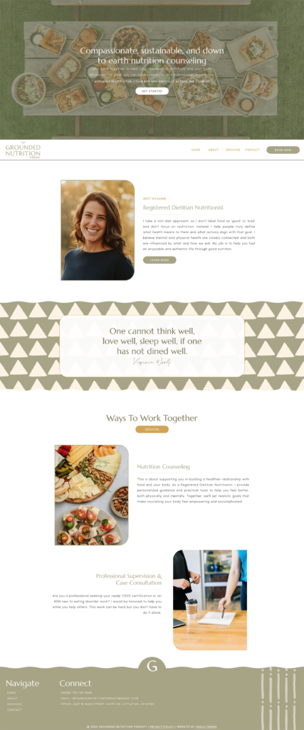
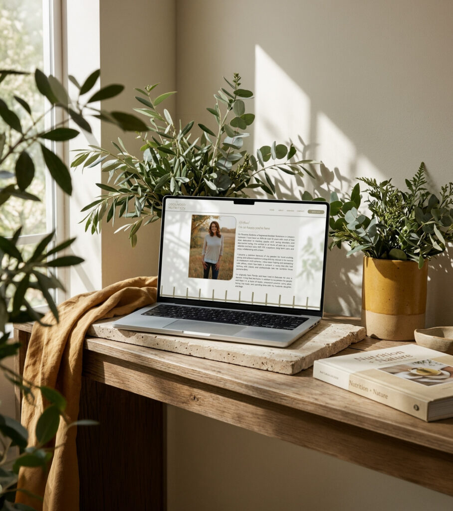
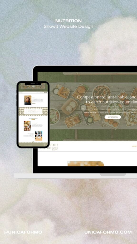
I designed the Showit site from scratch so the layout, typography, color, imagery, and content could all work together rather than trying to make an existing template fit the new brand.
That gave us room to create visual moments throughout the site without sacrificing usability.
Information is organized clearly, but the pages don’t feel like a stack of text and service descriptions. Warm imagery, intentional color blocks, subtle typography changes, and plenty of white space give the site a more editorial rhythm.
It’s a nutrition website, but it doesn’t look like every nutrition website.
Making Room for the Whole Practice
One of the more unique pieces of this project was balancing Roxanne’s client-facing nutrition work with her professional supervision services.
Both are important parts of Grounded Nutrition Therapy, but they’re speaking to different audiences.
The website needed to make those distinctions clear while keeping everything under one cohesive brand. I structured the experience so someone looking for nutrition counseling can quickly find the information they’re looking for, while dietitians and other professionals can easily discover Roxanne’s supervision work.
SimplePractice was also integrated into the website, creating a more direct path from learning about working with Roxanne to booking.
A Grounded Approach to Nutrition
The design isn’t just earthy because earthy colors look nice.
It reflects the philosophy behind the practice.
Roxanne helps clients move away from the pressure and confusion of dieting and toward a more confident relationship with food. That called for a visual identity that felt comfortable and inviting rather than rigid or overly polished.
There is room to slow down.
Room to explore.
And room for the website to feel like a real place rather than a digital brochure.

What Roxanne Had to Say
“Having built my own website years ago, I knew I was ready for a more professional and polished touch. Jordin definitely provided that while also helping me keep and highlight the aspects that represented me and my business. She worked really quickly and was very responsive to my feedback and requests, even when I wasn’t sure what it was I wanted. I am really impressed with the level of detail that went into her work and am so proud of my new site.”
-Roxanne S., Owner of Grounded Nutrition Therapy
A Brand and Website That Feel Like Grounded
By bringing the branding and website together, I was able to create a much more cohesive experience for Roxanne.
The colors, typography, imagery, and layouts all reinforce the same feeling, while the Showit build gives her the flexibility to continue evolving the website as her practice changes.
Most importantly, the finished site finally feels connected to the practice behind it.
Grounded, thoughtful, welcoming, and completely its own.
Questions About Earthy Nutritionist Website Design
What makes an earthy nutritionist website feel different?
An earthy nutritionist website can use natural colors, organic imagery, softer typography, and thoughtful layouts to create a more welcoming alternative to the typical clinical healthcare aesthetic. The goal is to make the visual experience support the practitioner’s philosophy, not simply follow a trend.
How do you create an earthy brand without making it feel too rustic?
Color and typography make a big difference. For Grounded Nutrition Therapy, earthy greens, warm neutrals, and mustard were paired with clean typography and structured layouts. That kept the brand natural and approachable while still feeling polished and professional.
Can an earthy nutrition brand still feel professional?
Absolutely. Earthy doesn’t have to mean casual or overly bohemian. A strong visual system can combine natural color and imagery with intentional typography, spacing, and structure to create something that feels both warm and professional.

Jordin Brinn is the founder and lead designer of Unica Formo — a creative studio in Columbus, Ohio, specializing in custom Showit website design and brand strategy for service-based businesses like coaches, consultants, therapists, creatives, and wellness professionals. With over a decade of business experience, she helps clients bring strategy, clarity, and personality to their online presence.
Explore design services and free resources at unicaformo.com.


