


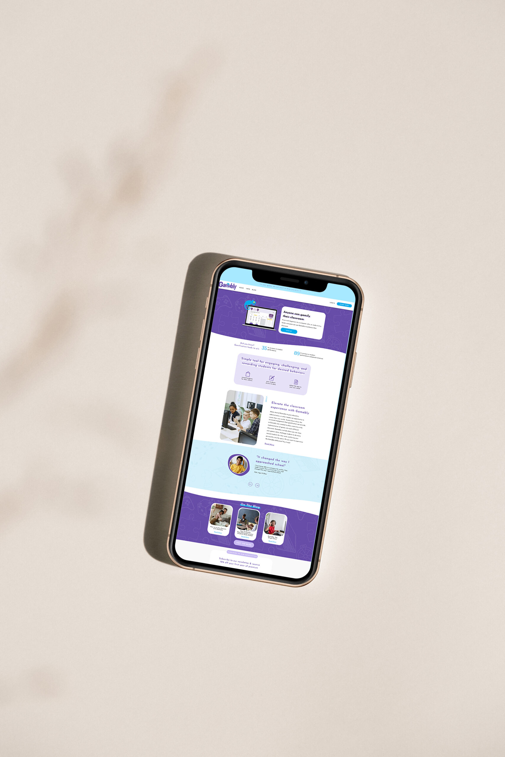
The Scope: Custom Showit Web Design
The Vibes: Bold, playful, future-forward
The Industry: Ed Tech + Education Innovation
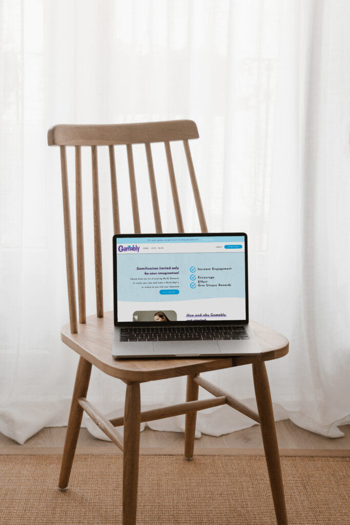
Gamably came to me with an interesting website challenge: they had a software product designed to help teachers gamify their classrooms, but they didn’t really have a marketing website to explain it. Their existing online presence was essentially a login screen, which worked for people who already knew what Gamably was, but didn’t do much to help a new visitor understand the product, see why it was valuable, or feel confident enough to take the next step.
For an education technology company, that distinction is especially important. Gamably needed to speak to educators and other potential customers who might be discovering the platform for the first time, while also communicating the bigger idea behind the product: learning can be more engaging, interactive, and effective when students have opportunities to play and participate.
The goal of this ed tech website design project was to take that software and turn it into a complete digital experience that could explain the product, establish credibility, showcase its features, and give the company a professional presence that matched the ambition behind what they were building.
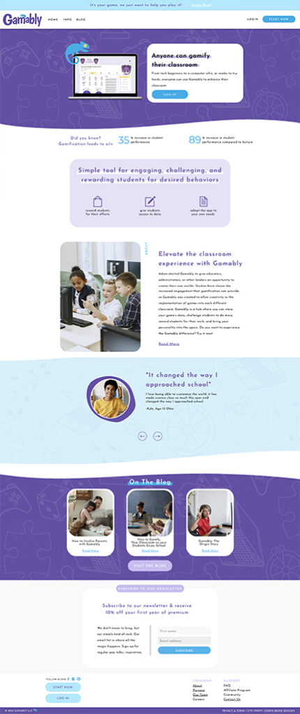
Turning a Software Product Into a Website People Could Understand
The biggest challenge wasn’t simply designing a pretty website. It was figuring out how to communicate a product that people couldn’t necessarily understand from a screenshot or a short description, especially when the audience included educators who needed to quickly understand how Gamably could fit into their classrooms.
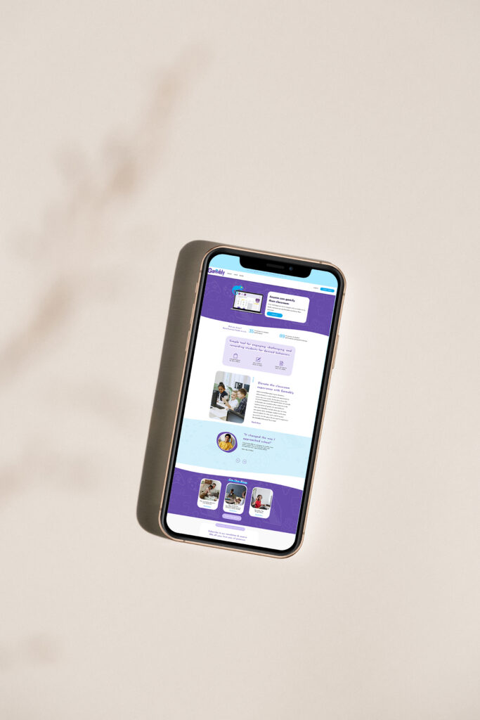
I built the website from the ground up around that need for clarity, creating a homepage that introduced the concept of classroom gamification while giving visitors clear pathways to learn more. From there, we developed dedicated sections for the software’s features, pricing, and other information potential customers would need before deciding whether Gamably was right for them.
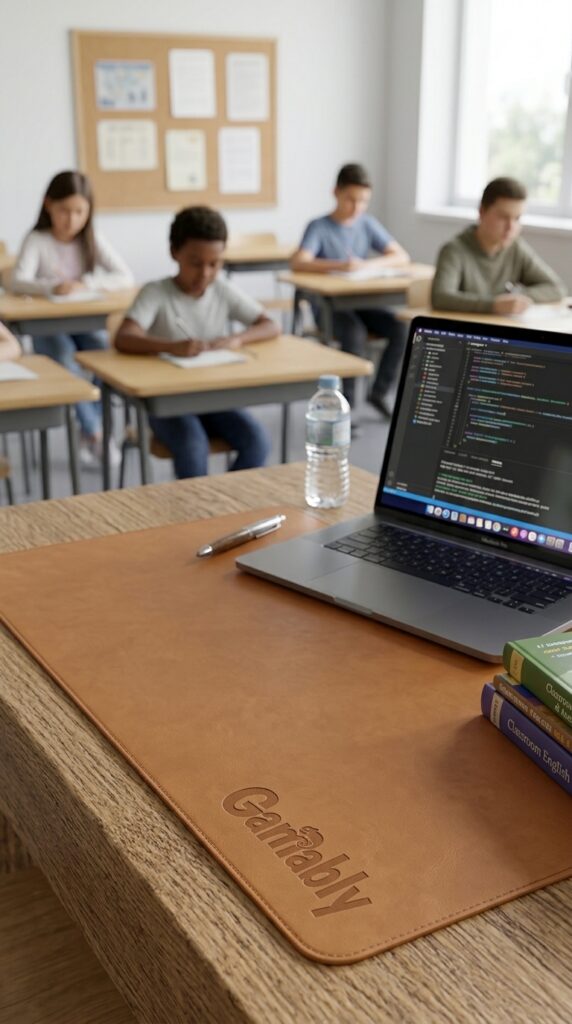
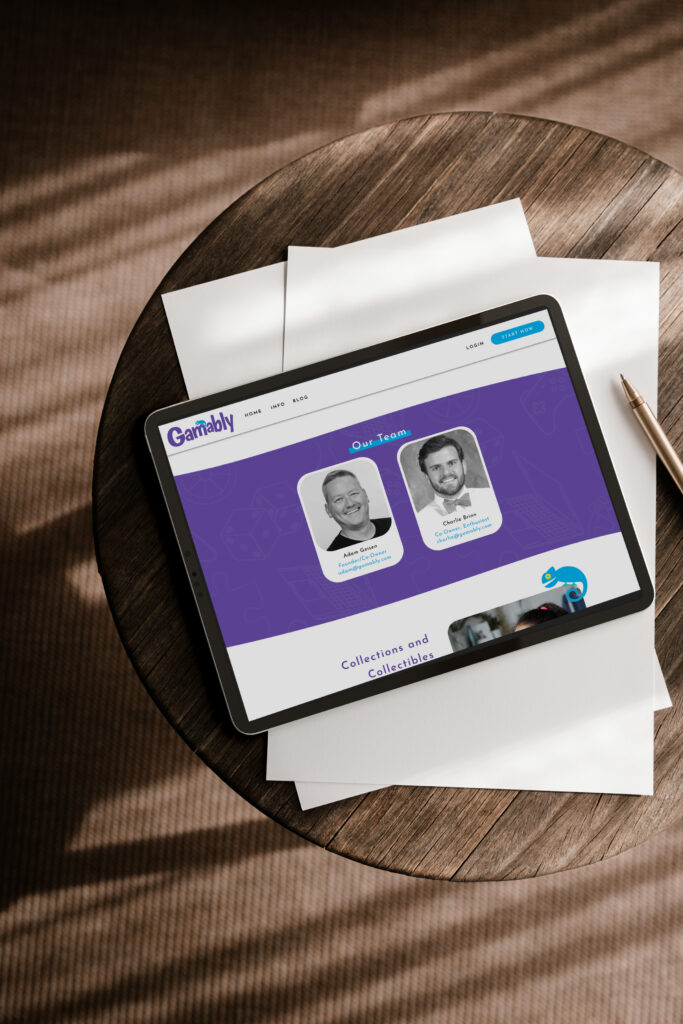
Visually, the website needed to strike a pretty specific balance. Gamably is playful by nature, but this isn’t a children’s toy or a casual game. It’s an education technology product, and the website needed to communicate that it was both innovative and legitimate. I used a bright, energetic visual direction with playful details and movement, while keeping the layouts, typography, and content structure polished enough to establish trust with educators and decision-makers.
That balance became one of my favorite parts of the project because the design could have easily gone too far in either direction. If it were overly corporate, it wouldn’t capture what makes Gamably interesting. If it were too playful, it could undermine the credibility of the software itself. The final design sits somewhere in between, giving the brand plenty of personality while still feeling like a serious ed tech company.
Building Trust Around the Product
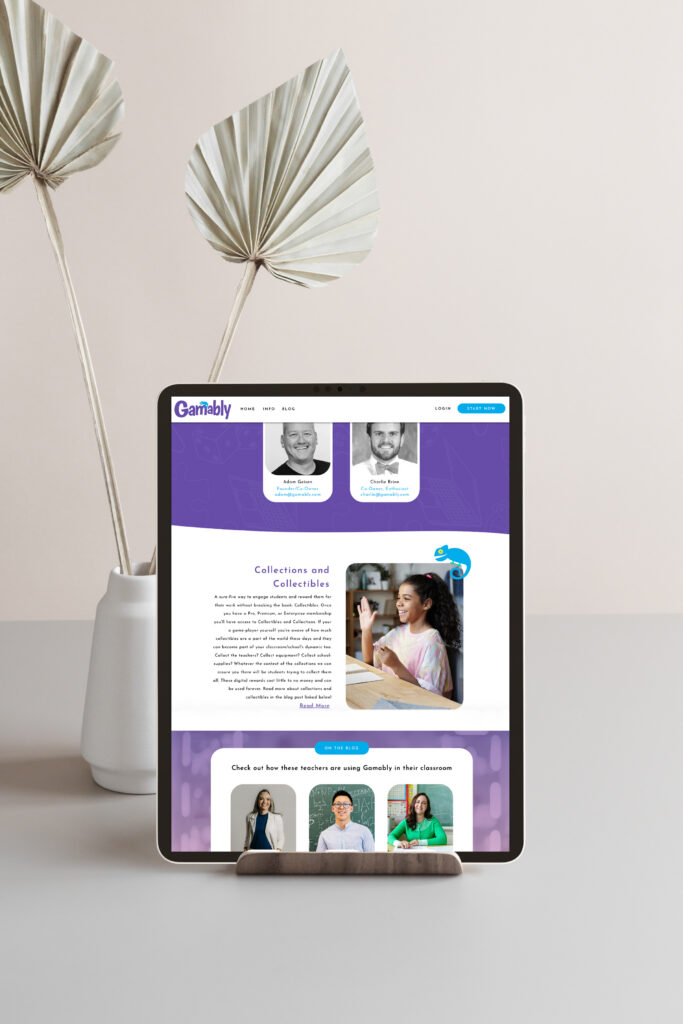
Since Gamably was introducing people to a product rather than simply selling a service, social proof and education were both important pieces of the website. Visitors needed more than a general statement about why gamification matters. They needed to understand what Gamably actually does, what they can expect from the platform, and why other people believe in it.
I built those pieces into the overall experience through clear messaging, feature-focused content, pricing information, testimonials, and a flexible blog that could give the company somewhere to continue educating its audience as the business grew.
That last piece was particularly important because an education technology company has the opportunity to build a lot of trust by teaching its audience before asking them to buy. The website gives Gamably a place to explain its philosophy, share information, answer questions, and continue building its authority within the ed tech space.
And the website ended up influencing more than just the company’s online presence. After launch, the Gamably team actually updated the look of their software because they wanted it to feel as polished and modern as the new website. That’s one of those project outcomes I love because it shows that a strong brand experience doesn’t necessarily stop at the website. Sometimes the website becomes the benchmark for how the rest of the business should feel.

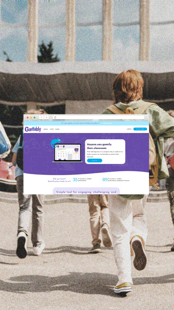
Your Ed Tech Product Deserves a Website That Matches It
Whether you’re building software for teachers, creating tools for schools, or developing technology that changes how people learn, your website should make the innovation behind your product obvious.
I can help you create an ed tech website that takes a potentially complex product and turns it into a clear, engaging experience that educators, administrators, and other decision-makers can actually understand and get excited about.

Client Love
“Jordin was such an amazing resource for our business. We got a full-website design for our Ed-Tech software company and it is stunning. It makes our product so much more polished by having the expertise of a passionate web-designer on our side. The process met all of our expectations for timing, essential aspects, and the design was so much better than we could have ever imagined.
Since the design process we’ve had so many compliments on our site and Jordin’s work even prompted us to make some changes to our software (we had to make it prettier to match our new site!). The site is perfect for us and to compete in the Ed-Tech space. It emphasizes our goals, future-forward design, and still creates clear communication with prospective clients. We are proud to have a Unica Formo designed site and know you will be too!”
—Adam G., Co-Owner of Gamably
Ed Tech Website Design FAQ
What should an ed tech website include?
An ed tech website needs to do more than introduce the company. It should clearly explain the product or platform, show how it works, communicate its value, and give potential customers enough information to feel confident taking the next step. Depending on the business, that might include feature pages, pricing, testimonials, educational resources, demos, case studies, or other content designed around the buying process.
How do you make an ed tech website feel innovative without sacrificing clarity?
The visual design can communicate innovation through typography, movement, color, imagery, and unexpected details, but those elements still need to support the content rather than compete with it. For Gamably, I paired a playful visual direction with a more structured layout and clear information hierarchy so the site could feel future-forward without becoming confusing.
Can Showit work for an ed tech company?
Yes. Showit can be a strong option for an ed tech marketing website when the goal is to create a highly customized, content-focused experience around a software product. The actual software can live on its own platform while the Showit website handles the marketing, education, brand storytelling, SEO content, and conversion experience around it.
Why does an ed tech company need a marketing website if it already has a software platform?
The software and the marketing website have two very different jobs. The platform is where customers use the product, while the website needs to explain why someone should use it in the first place. For Gamably, moving beyond a simple login screen gave the company a place to educate potential customers, showcase the product, establish trust, and communicate the bigger vision behind the software.

Jordin Brinn is the founder and lead designer of Unica Formo — a creative studio in Columbus, Ohio, specializing in custom Showit website design and brand strategy for service-based businesses like coaches, consultants, therapists, creatives, and wellness professionals. With over a decade of business experience, she helps clients bring strategy, clarity, and personality to their online presence.
Explore design services and free resources at unicaformo.com.


