


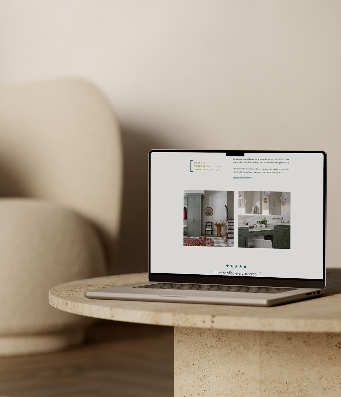
The Scope: Custom Showit Web Design
The Vibes: Refined, luxury, modern
The Industry: Interior Design & Studios
When your business is built around creating beautiful spaces, your own website has a pretty important job to do. It doesn’t need to compete with the work in your portfolio, but it does need to create the same sense of thoughtfulness, quality, and attention to detail that you bring to your clients’ homes.
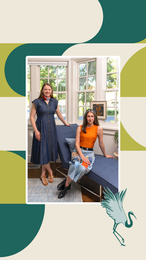
That was a big part of the goal for Sponzo Interiors. Stephanie had built a successful interior design studio, but her existing website felt more like an afterthought than an accurate reflection of the business she had worked so hard to build. She was ready for something more modern and refined, with a stronger visual presence and a much clearer way of communicating what made her studio different.
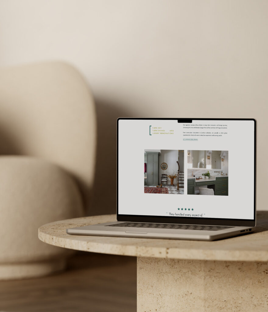
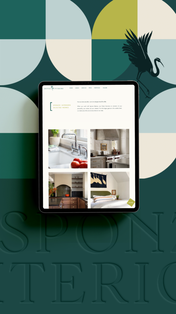
This modern interior designer website design gave us the opportunity to move the brand in that direction while creating a custom Showit website that could really let her portfolio take center stage.
From a DIY Website to a More Refined Studio Experience
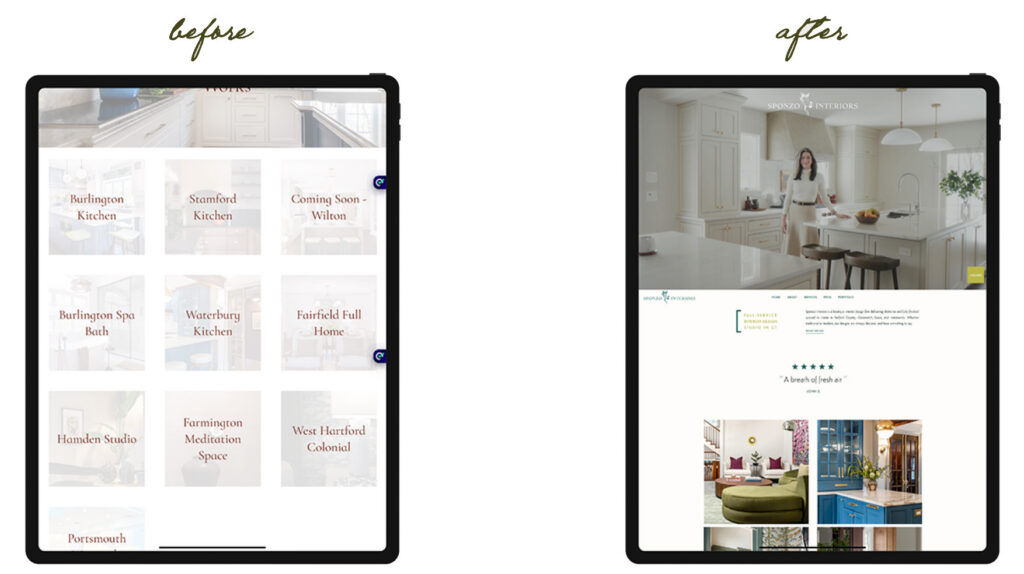
Sponzo Interiors’ original website was functional, but it wasn’t doing much to communicate the level of work Stephanie was producing or the direction she wanted to take the studio. The overall layout and structure felt a little too traditional, the copy didn’t give visitors much of a sense of the studio’s point of view, and the user experience made it harder than it needed to be for potential clients to understand the services and explore the work.
There was also a bigger positioning piece happening behind the scenes. Stephanie wasn’t simply looking for a prettier version of the same website. She wanted the new site to better reflect the kind of business she had built and support the more modern, elevated interior projects she wanted to attract moving forward.
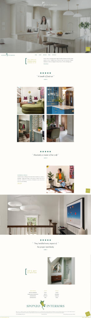
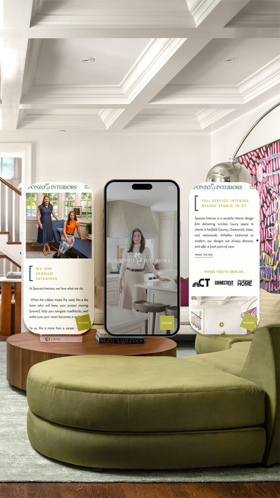
We started by moving the site from Squarespace to Showit, which gave me much more flexibility to rethink the layout and create a custom experience around the work rather than trying to fit the studio into the limitations of a more structured template. For an interior designer, that flexibility is especially valuable because the photography really needs room to breathe. Large-scale imagery, generous white space, subtle movement, and a strong visual hierarchy became a big part of the new experience, allowing the projects to feel immersive without making the website itself feel overly complicated.
At the same time, I reworked the structure and copy so the site had a much clearer narrative. The goal wasn’t to add more and more information. It was to make the right information easier to find and give visitors a better understanding of who Sponzo Interiors is, what the studio offers, and what kind of experience they can expect when they inquire.
The services page was given more intention, the navigation became much easier to follow, and the overall page hierarchy was simplified so someone could move through the site naturally from discovering the studio to exploring the portfolio and eventually getting in touch.
Visually, we kept things clean and minimal, but that doesn’t mean the design feels sparse. The larger imagery, intentional spacing, and subtle video elements create a more editorial feeling that lets the interiors do most of the talking. The result feels modern and elevated without falling into the trap of making a luxury website feel cold or overly formal.
A Website That Finally Matched the Business
One of the biggest wins from this project was that the website finally started to feel like it belonged to the business behind it.
Stephanie put a lot of thought and effort into creating a high-quality experience for her own clients, and she wanted that same level of care to come through when someone first encountered Sponzo Interiors online. A website that felt lackluster didn’t make sense for a studio producing such considered, beautiful work, especially when referrals and organic search were bringing potential clients directly to the site.
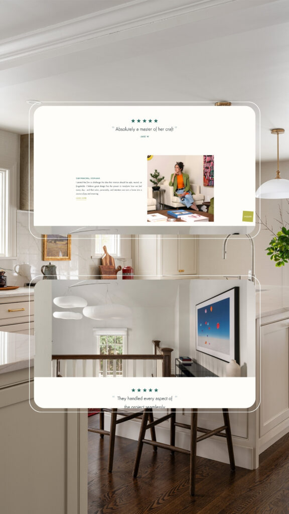
The new Showit website gives the portfolio the space it deserves while also doing a better job of communicating the studio itself. It feels more confident, more current, and much more intentional about the type of work Sponzo Interiors wants to be known for.
And that shift matters beyond aesthetics. When a potential client is referred to a designer, the website is often one of the first places they go to decide whether the studio feels like the right fit. Stephanie needed to feel confident sending people there, knowing the website would reinforce the quality of the work rather than make her feel like she needed to explain it first.
That’s exactly what she told me happened after the redesign.



Your Website Should Do Justice to the Spaces You Design
If you’ve put years into building an interior design studio and your website still feels like the part of your business you haven’t quite gotten around to, you’re not alone. But when your work is thoughtful, refined, and highly visual, your online presence should give potential clients a chance to see that before they ever step inside one of your projects.
If you’re an interior designer ready for a modern, elevated website that gives your portfolio room to shine and better reflects the caliber of your studio, I’d love to help.

Hear from Stephanie
“Before working with Jordin, our website felt like an afterthought. As a small business owner that puts so much time into delivering the best client experience possible, it just didn’t feel right for our online branding to feel so lackluster. I wanted something that felt like it matched the caliber of business I was running – a business I’m proud of, and have worked hard to build. Now that the website is complete, I feel so much more confident referred potential clients to view it, and am glad to know that leads who find us organically online will encounter a polished and professional site that reflects the quality of our work.”
-Stephanie, Owner of Sponzo Interiors
Questions About Modern Interior Designer Website Design
What makes a modern interior designer website feel elevated?
For an interior design studio, the photography should usually do a lot of the heavy lifting. Strong imagery paired with intentional white space, thoughtful typography, a clear visual hierarchy, and restrained design details can create an elevated experience without making the website feel overly designed.
Why move an interior design website from Squarespace to Showit?
Squarespace can work well for many businesses, but Showit gives me significantly more control over the layout and visual experience. For Sponzo Interiors, that flexibility meant I could create custom layouts around the studio’s photography and portfolio rather than working within the limitations of a more rigid template structure.
How can an interior designer’s website attract higher-end projects?
Your website should make it immediately clear what kind of work you do, how you approach your projects, and what clients can expect from working with you. The visual presentation matters, but so do the copy, project organization, services page, navigation, and overall experience. All of those pieces work together to position the studio before a potential client ever reaches out.

Jordin Brinn is the founder and lead designer of Unica Formo — a creative studio in Columbus, Ohio, specializing in custom Showit website design and brand strategy for service-based businesses like coaches, consultants, therapists, creatives, and wellness professionals. With over a decade of business experience, she helps clients bring strategy, clarity, and personality to their online presence.
Explore design services and free resources at unicaformo.com.


