


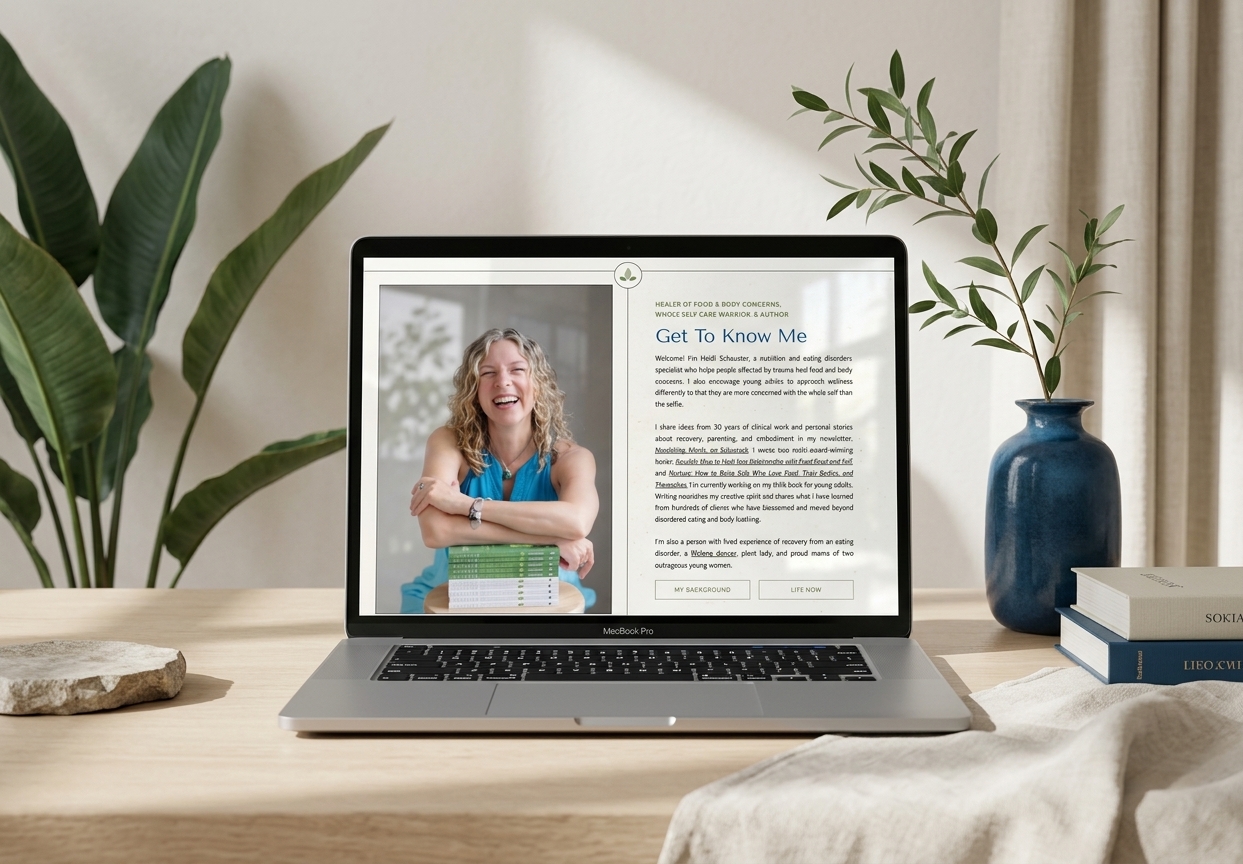
The Scope: Custom Showit Web Design
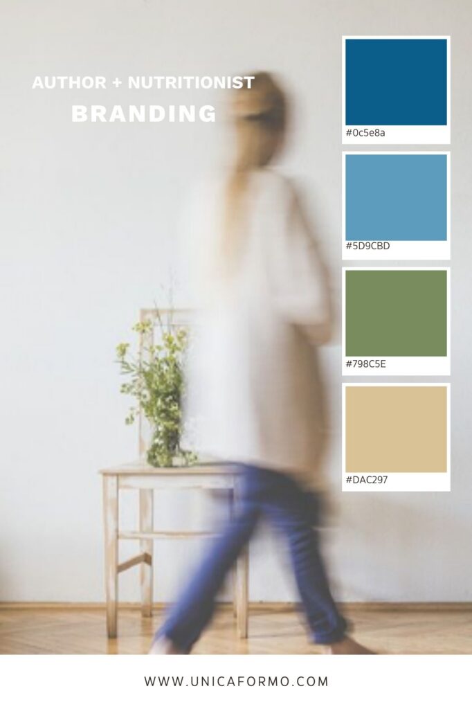
The Vibes: Grounded, Approachable, Calming
The Industry: Nutrition & Author
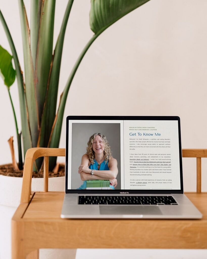
Some websites have a pretty straightforward job. A visitor needs to understand what you do, learn about your services, and figure out how to get started. Others have to hold a lot more than that, especially when your work spans different audiences, offerings, and parts of your professional life. That was the case with Nourishing Words, a nutrition practice and author platform created by Heidi.
Heidi has been doing this work since 1999, with a practice rooted in nutrition therapy, somatic experiencing, whole-self care, embodiment, and healing. Alongside her clinical work, she is also a published author and mentor, offering supervision and consultation to other professionals. Her website needed to make room for all of those things without feeling like visitors were walking into five different websites at once.
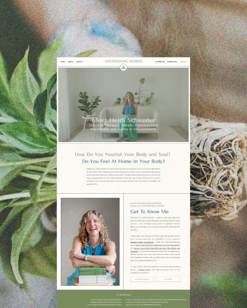
This nutritionist and author website design project was really about creating that sense of clarity. We needed to organize a substantial amount of information while still making the site feel calm, welcoming, and distinctly Heidi, with clear paths for people looking for clinical support, readers wanting to learn more about her books, and professionals interested in supervision or consultation.
Bringing a Complex Practice Into Focus
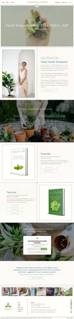
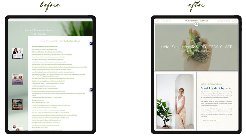
The challenge wasn’t that Heidi didn’t have enough to say. It was almost the opposite. Over the years, her website had accumulated a lot of information, and while that information was important, the overall experience had become difficult to navigate. Someone looking for nutrition therapy could easily find themselves sorting through information about books, professional supervision, somatic work, and other areas of Heidi’s practice before they really understood where they should go next.
At the same time, this wasn’t a website where we could simply strip everything down and start over with a few short pages. The depth of Heidi’s work is part of what makes her practice unique, and the new site needed to communicate that depth without making visitors feel overwhelmed.
I focused on creating a much clearer structure around the different ways people might interact with Heidi and her work, giving each audience a more obvious path through the site while still keeping everything connected. Her clinical services, writing, books, supervision, and consultation work all needed to feel like parts of the same larger practice rather than disconnected offerings.
That organization was also important from an SEO perspective. With so many different areas of expertise represented on the site, the website needed a structure that made sense not only to visitors but to search engines as well. Clear page hierarchy, intentional headings, internal linking, and distinct content around her different offerings created a stronger foundation for long-term search visibility without forcing the copy to sound like it was written for Google.
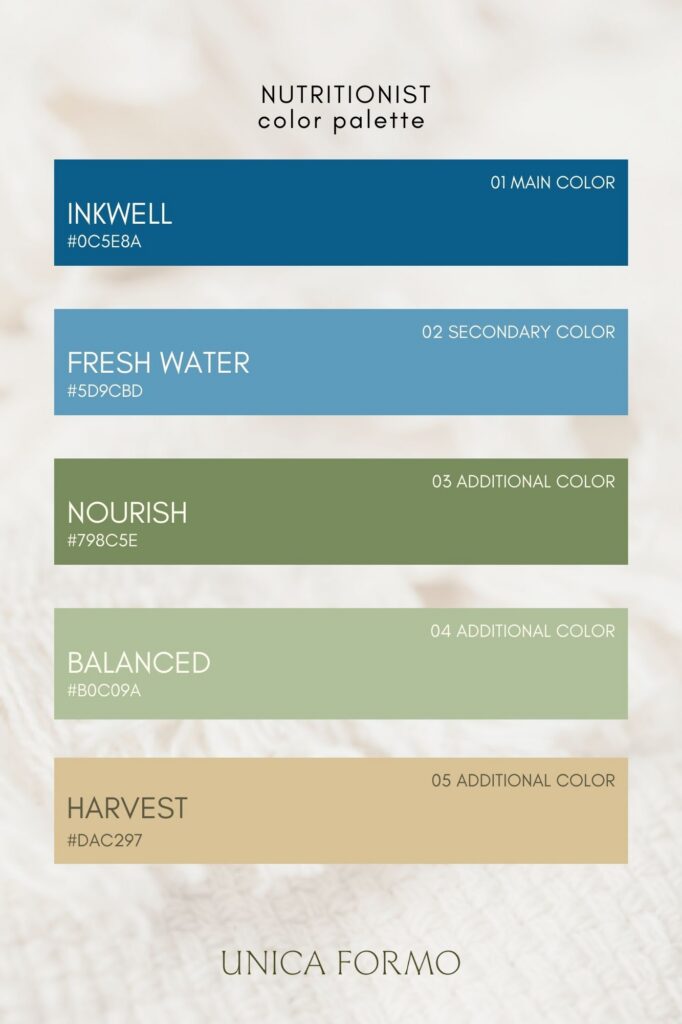
Visually, we took a similarly thoughtful approach. Heidi works with people navigating eating disorders, trauma, and body image concerns, so the website needed to feel safe from the very first interaction. I intentionally moved away from diet-focused imagery and anything that could feel triggering, instead using soft natural tones, clean typography, thoughtful spacing, and a calm visual rhythm throughout the site.
The result feels professional without feeling clinical, and welcoming without losing the credibility that comes from Heidi’s years of experience. There is enough visual interest to make the site feel personal, but nothing competing with the information or making the experience harder to navigate.
Making Room for the Author Behind the Practice
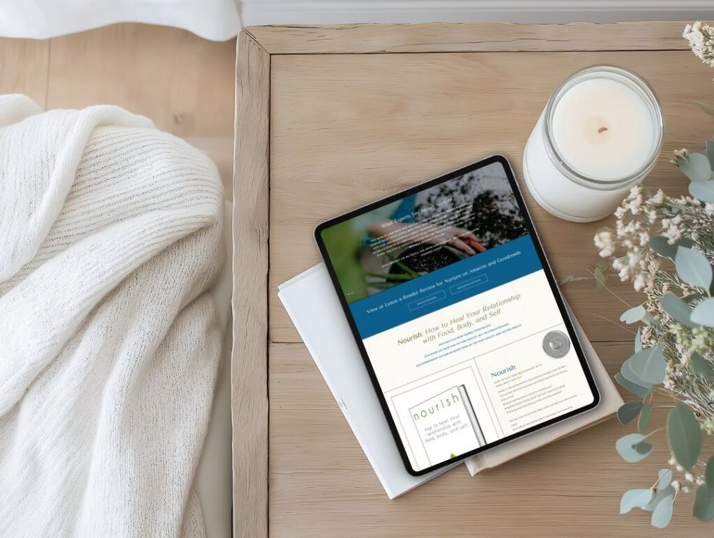
One of the things I especially wanted to make sure we didn’t lose in the redesign was Heidi’s work as an author. Her books and writing aren’t just an extra section of the website. They are an important part of how she shares her expertise and connects with people beyond her one-on-one clinical work, so they needed to have a real presence within the overall experience.
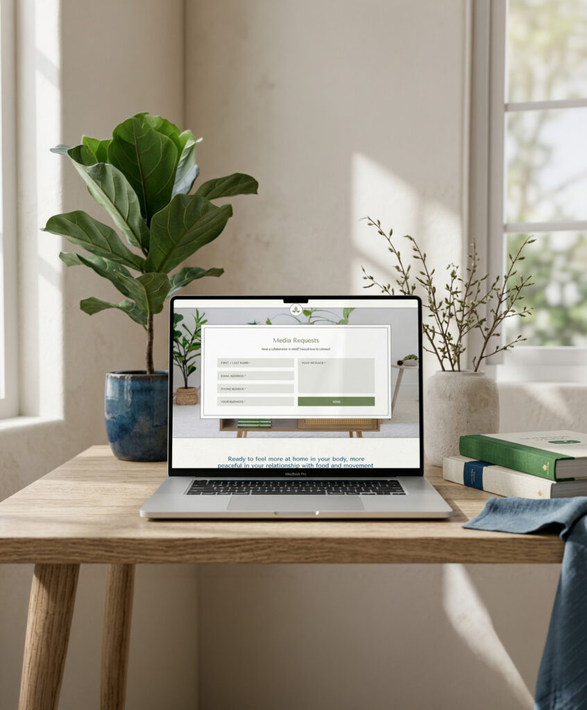
The same was true for her supervision and consultation work. Heidi isn’t only speaking to potential clients. She is also speaking to other professionals who are looking for mentorship, guidance, and a deeper understanding of this work. The website needed to acknowledge those different audiences while still making the overall experience feel cohesive.
That meant thinking carefully about how someone enters the site and where they go from there. A reader discovering Heidi through one of her books should be able to easily explore more of her work. Someone looking for clinical support should be able to understand her approach without having to dig through her author content first. And a professional looking for supervision should immediately be able to find the information relevant to them.
Those different paths are now much easier to follow, while the design still makes it clear that all of this work comes from the same person and the same underlying philosophy around nourishment, healing, embodiment, and whole-self care.
For me, that is what made this project more than just a website redesign. It was about taking everything Heidi had built over many years and giving it a digital home that could actually support all of it, rather than asking her to simplify her work just to make the website easier to understand.



Your Website Should Make Room for Everything You Do
When your work has grown beyond a single service or audience, your website shouldn’t force you to choose between showing your full expertise and keeping things easy to understand. The right structure can make room for the different pieces of your practice while still giving every visitor a clear place to start.
If you’re a nutritionist, author, educator, or wellness professional with a lot to say and several sides of your work to share, I’d love to help you turn all of those pieces into a website that feels cohesive, thoughtful, and completely your own.
Heidi’s Testimonial
“Jordin went above and beyond for my website design project. She not only gave my site a very professional glow-up, but she was a pleasure to work with throughout the whole creative process. It was a lot more fun than I thought it was going to be, and her collaborative spirit was a big part of that. She never made me feel weird for making a request; sometimes, as a writer, I can get fairly detail-oriented in the editing process.
When there were some tech issues with the site upon completion that had nothing to do with her work, related to connectivity with my domain host and other platforms that I use, she put in many hours of work to understand the problem and make sure that it was made right. I would hands-down recommend Jordin Brinn and Unica Formo. My website is beautiful and functional, and the whole process from start to finish was easeful because Jordin is both professional and approachable.”
-Heidi S., Owner of A Nourishing Word
Questions About Nutritionist and Author Website Design
What makes an author website different from a typical nutrition website?
When a nutrition professional is also an author, the website often needs to serve several audiences at once. Potential clients may be looking for services, while readers want to explore books and writing, and other professionals may be interested in supervision, consultation, or educational resources. The challenge is creating clear paths for each audience while keeping the website connected as one cohesive experience.
Can a website support both clinical services and an author platform?
Absolutely. The key is creating enough structure that each part of the business has room to be understood on its own, while still making the relationship between those offerings clear. For Nourishing Words, the website was designed to make Heidi’s clinical work, writing, books, and professional offerings feel like connected parts of the same practice.
How can a nutrition website be designed with sensitive audiences in mind?
For practices working with eating disorders, trauma, body image concerns, or other sensitive topics, the visual choices matter. Thoughtful imagery, clear navigation, readable typography, intentional content structure, and an overall calm visual direction can help create a more welcoming experience without relying on imagery that may feel triggering or out of place.

Jordin Brinn is the founder and lead designer of Unica Formo — a creative studio in Columbus, Ohio, specializing in custom Showit website design and brand strategy for service-based businesses like coaches, consultants, therapists, creatives, and wellness professionals. With over a decade of business experience, she helps clients bring strategy, clarity, and personality to their online presence.
Explore design services and free resources at unicaformo.com.


