


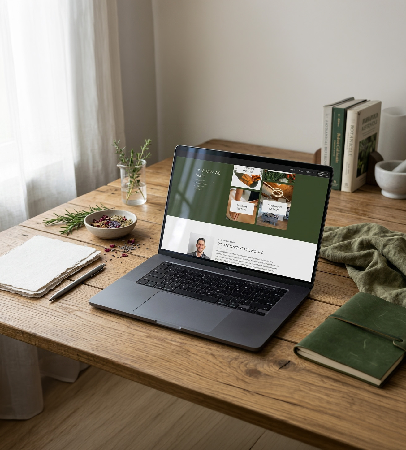
Modern Naturopath Website Design | The Herbal Room
The Scope: Custom Showit Web Design
The Vibes: Clean, Natural, Elevated
The Industry: Naturopathic Medicine & Holistic Health
The Herbal Room is a naturopathic practice built around a more modern, simplified approach to holistic care, combining naturopathic medicine, botanical therapies, supplements, and lab-based support to create a more personalized experience for each patient. When Antonio came to me, he already had a practice with a lot of depth behind it, but his website wasn’t communicating that in the same thoughtful, professional way he was showing up for his patients.
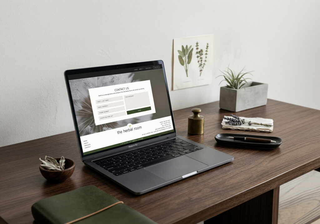
For this modern naturopath website design, the goal was to create an online presence that felt clean, elevated, and easy to navigate without losing the natural, whole-body philosophy that makes The Herbal Room different from a more traditional healthcare practice. I wanted the site to feel polished and credible while still giving visitors a sense that there was a real person and a very personalized approach to care behind it.

Creating a Modern Take on Naturopathic Care
Naturopathic medicine can be unfamiliar to people who have never worked with a naturopath before, which meant the website had to do more than simply list services and provide information. It needed to help a potential patient understand what The Herbal Room actually offers, why the approach is different, and what they could expect from working with Antonio, all without making the experience feel overly clinical or overwhelming.
The original website felt pieced together and didn’t quite match the level of care or professionalism behind the practice. There was a lot of valuable information, but the overall experience lacked the refinement and clarity needed to make that information easy to understand. With services ranging from mood support and gut health to long-term wellness planning, custom botanical tinctures, high-quality supplements, and more clinical lab-based support, there were also several different pieces of the practice that needed to fit together naturally.
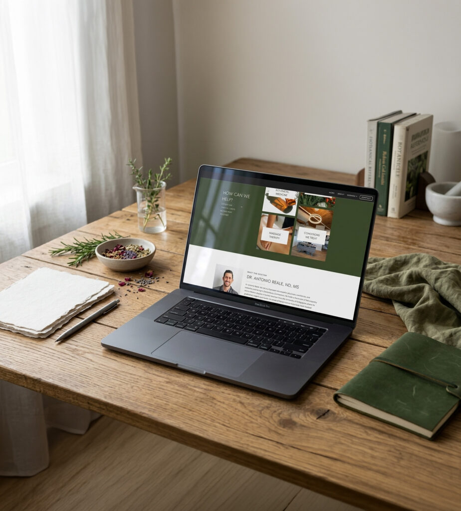
That balance became one of the biggest considerations throughout the design. I didn’t want to take the typical overly earthy approach that can sometimes be associated with holistic health, but I also didn’t want to push the design so far into a clinical direction that it lost the natural side of the practice. Instead, I leaned into a more modern interpretation of naturopathic medicine, using muted herbal tones, subtle texture, structured typography, and plenty of breathing room to create something that feels grounded without feeling dated or overly “wellness.”
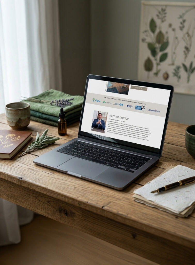
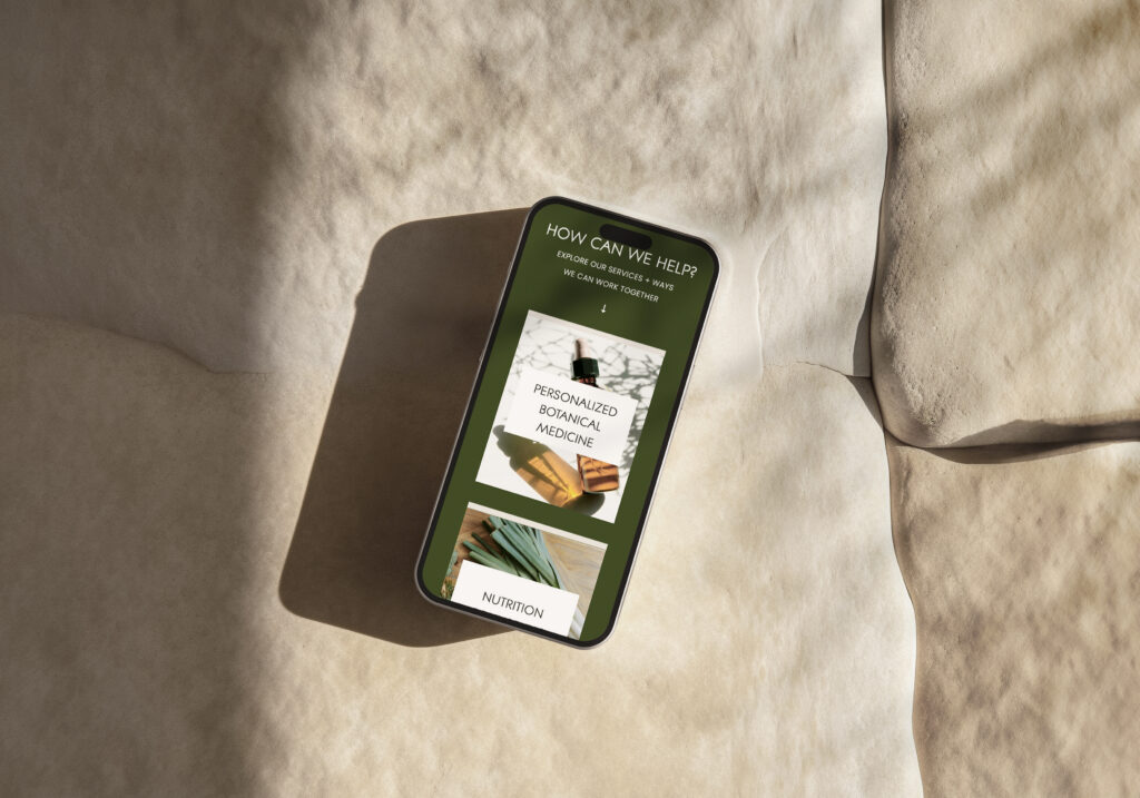
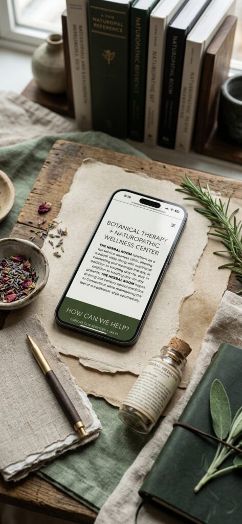
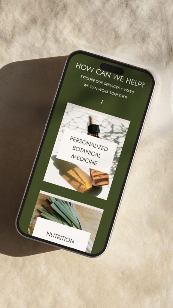
The result is a website that gives The Herbal Room room to communicate everything it offers while still feeling approachable for someone who may be completely new to naturopathic care. The navigation was intentionally simplified so visitors can find services, understand the process, and move through the site without having to work too hard to figure out where they should go next, which was especially important for the mobile experience.

Bringing Botanical and Clinical Care Together
One of the things I really enjoyed about this project was figuring out how to visually represent the two sides of Antonio’s practice. The Herbal Room isn’t only about natural remedies, but it also isn’t a traditional clinical practice, so the website needed to acknowledge both sides rather than leaning too heavily in either direction.
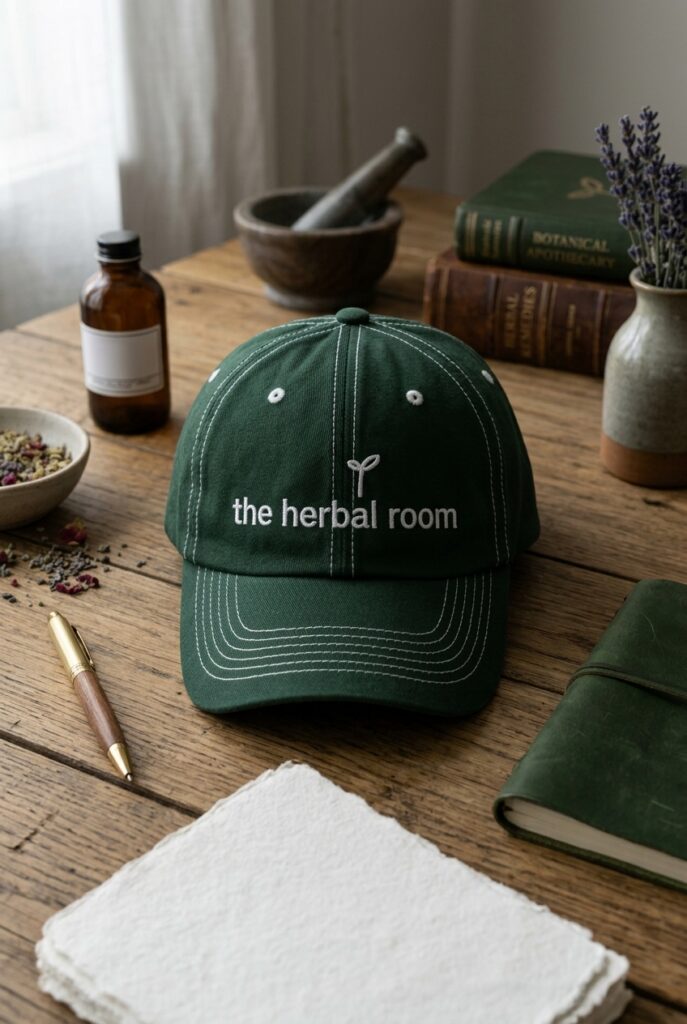
The visual direction pulls inspiration from things like herbal tinctures and natural materials, but pairs those elements with cleaner layouts and more structured typography so the overall experience still feels professional and trustworthy. Instead of filling the site with obvious natural imagery or leaning heavily into an earthy aesthetic, I used those references more subtly, allowing the design to feel modern first while still reflecting the philosophy behind the practice.
That same thinking carried into the content structure and user experience. The goal wasn’t to remove information or oversimplify what Antonio does, but to organize it in a way that makes the information feel approachable. A potential patient should be able to land on the site, get a sense of what The Herbal Room is about, understand the types of support available, and feel confident taking the next step without needing to already understand naturopathic medicine.
This is where the strategy behind the design really mattered. The website needed to look good, but it also needed to make a practice that can feel unfamiliar to new visitors much easier to understand. Every page and pathway was designed with that in mind, creating a more cohesive online presence that reflects the level of thought and personalization that goes into the actual patient experience.
Ultimately, the new site gives The Herbal Room a much stronger digital presence without making the practice feel like something it isn’t. It’s clean and elevated, but still natural. It’s professional, but not overly clinical. And most importantly, it gives Antonio a website that can clearly communicate the depth of his work while making that work feel much more approachable to the people he’s hoping to reach.


Words from Antonio
“Jordin was amazing to work with, from start to finish! Before I committed to the project, Jordin spent time answering questions I had and looking at ideas for websites to make sure it would be a good fit. Even though I had yet to commit to working with her, the conversations never felt rushed and Jordin took time to listen. Once we began, Jordin moved quickly, not only working within the promised timeframe, but finishing the project early! Once finished, she offered a 2 week period after the completion date where I could ask questions, so once again, her support has never felt rushed. Lastly (and maybe most importantly), the quality of her work is great and the website is exactly what I was looking for! Super happy with the results and a definite improvement from what I had before. Highly recommend all around!”
—Antonio R., Owner of The Herbal Room
A Website That Makes Your Approach Easier to Understand
Your approach to care might be thoughtful and personalized, but that doesn’t mean a potential client or patient will understand it the moment they land on your website. The right design can take the complexity behind your work and turn it into an online experience that feels clear, credible, and approachable while still reflecting what makes your practice different.
If you’re ready for a website that feels like a more accurate reflection of the work you’re already doing, let’s talk about your project.
Frequently Asked Questions
What makes a naturopath website different from a traditional healthcare website?
A naturopathic practice often needs to explain a more personalized or integrative approach to care, especially for visitors who may not be familiar with naturopathic medicine. The website should build credibility while also making the practice feel approachable, natural, and easy to understand. For The Herbal Room, that meant finding the right balance between the clinical and botanical sides of the practice.
Can a naturopath website still feel modern without being overly clinical?
Absolutely. A modern healthcare website doesn’t have to rely on the typical clinical look, and a holistic website doesn’t have to be heavily earthy or bohemian either. For The Herbal Room, I used clean layouts, structured typography, muted natural tones, and subtle texture to create a more elevated look that still feels connected to the practice’s whole-person approach.
What platform was The Herbal Room’s website built on?
The Herbal Room’s website was custom designed and built in Showit, allowing me to create a tailored user experience around the practice’s services, content, and brand direction while keeping the site flexible and easy to manage.
Can you design a website for a different type of health and wellness practice?
Yes. I work with a range of health and wellness professionals, including naturopaths, nutritionists, therapists, coaches, and other service-based practitioners. Each website is designed around the specific services, audience, personality, and goals of the practice rather than using the same visual approach for every wellness business.

Jordin Brinn is the founder and lead designer of Unica Formo — a creative studio in Columbus, Ohio, specializing in custom Showit website design and brand strategy for service-based businesses like coaches, consultants, therapists, creatives, and wellness professionals. With over a decade of business experience, she helps clients bring strategy, clarity, and personality to their online presence.
Explore design services and free resources at unicaformo.com.


