



- Hero Section (Above the Fold)
- Trust Building and EEAT Section
- Who This Is For Section
- Services or Offer Structure Section
- How It Works, Fees, and Policies Section
- FAQ Section
- Call to Action Section
- Bonus: Testimonials and Trust Placement Strategy
- Nutritionist Services Page Examples
- Final takeaway from these examples
- Bringing It All Together
- Frequently Asked Questions
Your services page is one of the most important parts of your nutrition website.
It’s often where potential clients go when they are interested in working with you but still need clarity before reaching out. They are trying to understand what you offer, who you help, what the process looks like, and whether you are the right fit.
But many nutritionists and dietitians treat this page like a simple list of services. They add their offers, include a few details, and expect visitors to know what to do next.
A strong services page does much more than explain what you offer. It guides visitors through a decision, builds trust, and helps them feel confident about taking the next step.
In this guide, I am sharing a simple website structure you can follow section by section. Think of it as a nutritionist services page template you can use to plan or refine your own page, from your introduction to your services, trust-building content, and final call to action.
Whether you are building a new website or updating an existing one, this framework will help you create a services page that feels clear, intentional, and aligned with the clients you want to work with.
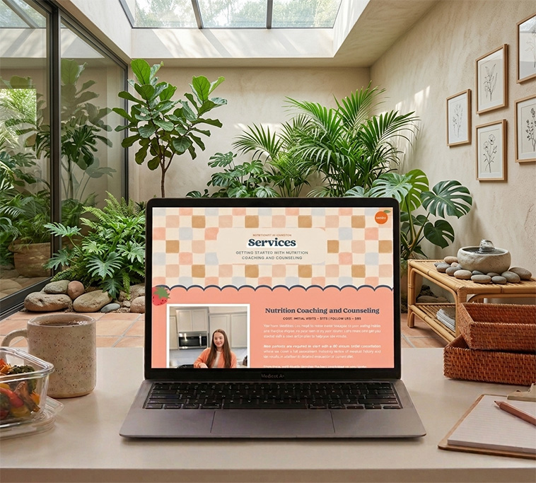
View BodyFit Nutrition’s full project here
Hero Section (Above the Fold)
This is the first section of your services page. Its job is not to explain everything you do. Its job is to help the right person feel like they are in the right place and understand what working with you might look like.
Your hero section should always include your H1. This is one of the most important SEO and accessibility elements on the page, but it also plays a role in clarity. Your H1 should clearly describe what you do in simple, searchable language so both users and search engines understand your focus immediately.
For nutritionists and dietitians, this is not the place for clever or vague wording (!!!!) It is better to be direct and descriptive than overly branded or abstract.
A strong H1 might look like:
H1:
Nutrition support for sustainable energy, digestion, and balance
Under your H1, your supporting text should expand on what you do in a simple, human way. Avoid jargon or overly technical language. The goal is to make your services instantly understandable.
Supporting text:
Work with a nutrition professional to build sustainable habits that support your energy, digestion, and overall health without restrictive approaches or confusion.
This is also a good place to include basic SEO signals like location if you serve a specific area or want to show local relevance. Something as simple as including your city or region in a natural way can help your visibility without feeling forced.
If you are unsure how headers should be structured or how they impact SEO on Showit websites, you can read this guide on Proper Header Hierarchy In Showit.
Then you guide them toward a single clear action.
Call to action:
Book a consultation
This section should stay focused and easy to scan. If someone reads only this part of your page, they should understand what you do, who it is for, and what to do next.
A strong services page always starts with clarity before detail.
Trust Building and EEAT Section
Once you have introduced what you do in the hero section, the next step is building trust.
Most visitors will not book simply because they understand your services. They need to feel confident that you are credible, experienced, and aligned with what they are looking for.
This is where your services page should start to demonstrate expertise in a clear and grounded way.
For nutritionists and dietitians, trust is built through a combination of your experience, your approach, your education, and how well you understand the client’s problem. This is often referred to as E-E-A-T, which stands for experience, expertise, authority, and trustworthiness.
learn more about building trust with E-E-A-T principles in your website here
Instead of listing credentials in a dense block at the top of the page, this section should focus on helping the visitor understand how you work and why your approach is effective.
This might include a short explanation of your philosophy around nutrition, how you support clients differently than more generic or restrictive approaches, and what someone can expect from working with you.
The goal is not to prove everything you know in one section. The goal is to help the right person feel like they are in capable hands.
This section should feel grounded, not overwhelming. It should sound like you are explaining your approach to someone who is already interested but still deciding whether to move forward.
When done well, this part of the page creates a sense of calm confidence. The visitor does not need to be convinced through pressure or persuasion. They simply feel more certain that they are in the right place.
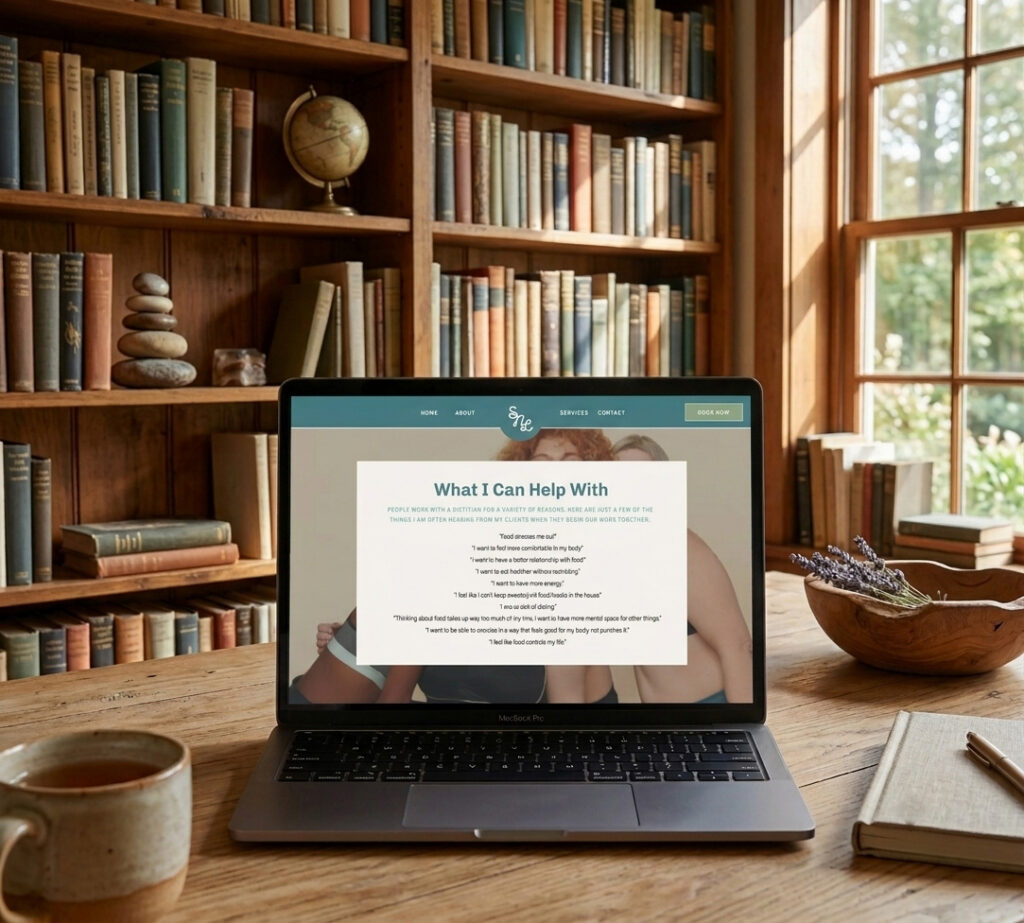
View Satisfy Nourish Love’s full project here
Who This Is For Section
After building trust, the next step in a nutritionist services page is helping visitors understand whether your support is actually the right fit for them.
This section is not about listing everything you can do. It is about helping the right clients see themselves in your work and gently filtering out those who are not aligned.
For nutritionists and dietitians, this part is especially important because people often arrive feeling overwhelmed, unsure, or in the process of comparing multiple providers. A clear “who this is for” section helps reduce that friction.
Instead of writing in a generic or overly broad way, this section should speak directly to the lived experiences your ideal client is having in their day-to-day life.
This might include feeling constantly tired even when sleep seems adequate, dealing with digestive discomfort like bloating or irregular digestion, or feeling confused about what foods actually support their body. It might also look like trying different approaches in the past without seeing lasting change, or feeling stuck between conflicting nutrition advice.
The goal is not to diagnose or label these experiences, but to reflect them in a way that feels familiar and understood. When someone reads this section, they should feel like you are describing what they have been going through in a simple and grounded way.
This support is for you if you are looking for guidance with nutrition that feels realistic, supportive, and sustainable in your everyday life.
From there, you expand on the types of situations or goals your clients typically come in with. The focus stays on experience rather than clinical language, and on what life feels like before working with you versus what becomes possible after.
You can also briefly acknowledge who your work is not for, but this should be handled gently and without unnecessary contrast. The goal is clarity, not exclusion.
When done well, this section helps the right client feel like the page is speaking directly to them, which makes the decision to move forward feel much easier.

View Zoë Schroeder Nutrition’s full project here
Services or Offer Structure Section
Once a visitor understands who you help, the next step is clearly showing them what you offer.
This is often where nutritionist websites become way too complicated. They either list too many options at once or describe services in a way that feels unclear or overly clinical. A strong services page keeps this section simple, structured, and easy to understand.
The goal is not to explain every detail of your process. The goal is to help someone quickly recognize, “this is the type of support I need.”
Instead of long paragraphs of explanation or dense descriptions, each service should be presented as its own focused section with a clear name, a short explanation of who it is for, and what changes for the client after working together.
The name of each service should be simple and easy to understand. Avoid jargon or overly branded names that do not communicate meaning on their own. A visitor should not have to decode what the offer is.
Each service description should focus less on deliverables and more on outcomes. Nutrition clients are not just buying sessions or plans. They are looking for clarity, relief, support, and sustainable change in their daily lives.
So instead of listing what is included in a technical way, translate it into what it actually means for the client. For example, instead of focusing on the number of sessions or resources, focus on what becomes easier or clearer for them after working with you.
This section should feel organized and intentional. If someone scrolls through it quickly, they should still understand their options and feel confident about what each path looks like.
You are not trying to sell everything here. You are helping the right client recognize the right starting point.
When this section is done well, it reduces decision fatigue and makes the next step feel much simpler.
How It Works, Fees, and Policies Section
Once someone understands your services, the next step is removing uncertainty about what working together actually looks like.
This is where you help potential clients feel grounded in the process. A simple explanation of how someone moves from inquiry to becoming a client can make a big difference in whether they feel ready to take action.
Most visitors are not looking for complexity here. They want to understand what happens first, how long things take, and what level of commitment is involved. Keeping this section clear and easy to scan builds confidence and reduces hesitation.
Alongside your process, this is also where you should include your practical details. This includes your fees or starting investment, your payment structure, your cancellation or rescheduling policy, and whether you accept insurance or provide superbills for reimbursement.
Being transparent about this information on your services page helps set expectations early. It also filters in the right clients and reduces unnecessary back and forth later in your inquiry process.
Policies do not need to feel heavy or overly formal. A simple, direct explanation is enough. Clearly stating your cancellation window, late policy, and payment expectations helps avoid confusion later.
If you accept insurance, you can briefly explain how that works in simple terms. If you are private pay only, that should also be stated clearly so there is no uncertainty.
FAQ Section
A FAQ section is a key part of a strong nutrition services page because it removes hesitation before someone ever needs to reach out.
This is where you answer common questions about working with you, such as what a first session looks like, how scheduling works, whether you offer virtual appointments, what types of clients you work with, and how billing or insurance is handled.
The goal is not to answer everything. The goal is to address the questions that typically come up right before someone is ready to book.
From an SEO perspective, this section also gives you an opportunity to naturally include question-based search terms that potential clients are already typing into Google. This helps your page show up for more specific, intent-driven searches.
If you are building your site in Showit, you can enhance this section with FAQ schema markup. This is added in your page settings under the page title area, inside the advanced settings or custom head section depending on your setup. Adding FAQ schema helps search engines better understand your content and can improve how your page appears in search results, especially for question-based queries. Your website designer should be able to add this in for you.
Call to Action Section
Before the page ends, your services page should include a clear and focused call to action.
At this point, the visitor has seen what you offer, understood who it is for, and had their questions addressed. This is where you guide them to take the next step while their interest is still active.
Your call to action should be simple and confident. Focus on one clear action, such as booking a consultation or applying to work with you.
Avoid over-explaining or repeating information from earlier sections. The goal here is clarity, not persuasion through volume.
It can be helpful to briefly reduce any remaining hesitation by reinforcing that the next step is simply an initial conversation or application, rather than a high-pressure commitment.
The goal is to make the decision feel easy for the right person.
Bonus: Testimonials and Trust Placement Strategy
Testimonials are one of the most effective ways to build trust on a nutrition website, but they are often underused or placed in a single section without much intention.
A more strategic approach is to treat testimonials as trust-building elements across your entire website, not just something that lives on one page. Many nutritionists and dietitians benefit from having a dedicated testimonial section on key pages, rather than trying to collect everything into one long list.
This allows you to reinforce trust at different decision points, such as near your services overview, within your about page, or alongside your main call to action.
One important consideration in this industry is confidentiality. Nutritionists and dietitians often cannot share full client identities, photos, or detailed personal information due to privacy standards and ethical guidelines.
Because of this, testimonials do not need to include full names or identifying details to be effective. Many professionals use initials, first names only, or anonymized identifiers when sharing client feedback directly on their website.
Another option is encouraging clients to leave a Google review, where they can choose how they want their name displayed and give consent for public visibility. This can make it easier to share testimonials while staying within appropriate privacy boundaries.
We also use this approach with our own web design clients at Unica Formo, especially in wellness and service-based industries, to make sure we are respecting confidentiality while still highlighting real client experiences and outcomes.
If you want to improve the quality of your testimonials, it is important to guide clients toward sharing transformation-based feedback rather than generic praise. The most powerful testimonials focus on what changed, what felt easier, and what the experience was like working with you.
You can read a full guide on how to request better testimonials here.
When used well, testimonials are not just social proof. They are one of the clearest ways to help future clients understand what working with you actually feels like.
Nutritionist Services Page Examples
Seeing how a nutritionist services page template comes to life in real websites can make the structure much easier to understand and apply.
At this stage of the page, the goal is not to explain the strategy again. It is to show how these principles look when they are implemented in real client work.
Each of these examples was designed with clarity, trust, and conversion in mind. The services pages focus on simplifying offers, guiding the visitor through the decision-making process, and helping potential clients quickly understand what working together looks like.
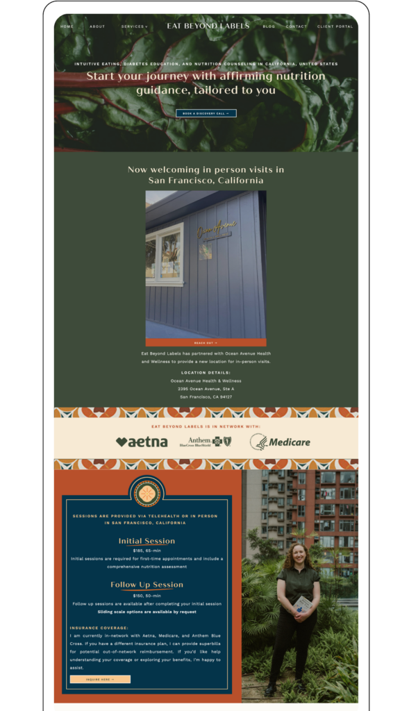
Eat Beyond Labels
This services page is a strong example of clarity through depth. Instead of listing generic offerings, it clearly organizes services around lived experiences and client needs.
What stands out is how the page communicates inclusivity and specificity at the same time. It speaks directly to different client situations while still maintaining a cohesive message.
It also does an excellent job of filtering who the practice is for without feeling restrictive or clinical. This supports decision-making without overwhelming the visitor.
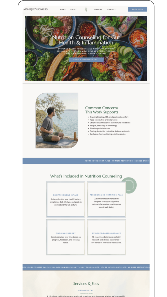
Monique Vuong RD
This services page does a strong job of positioning the dietitian as both knowledgeable and approachable.
The structure is clean and easy to follow, which helps reduce decision fatigue for the visitor. Each service feels intentional and clearly defined, without unnecessary complexity.
It also does a good job of reinforcing trust through credentials and approach, without letting that overshadow the client experience or messaging.
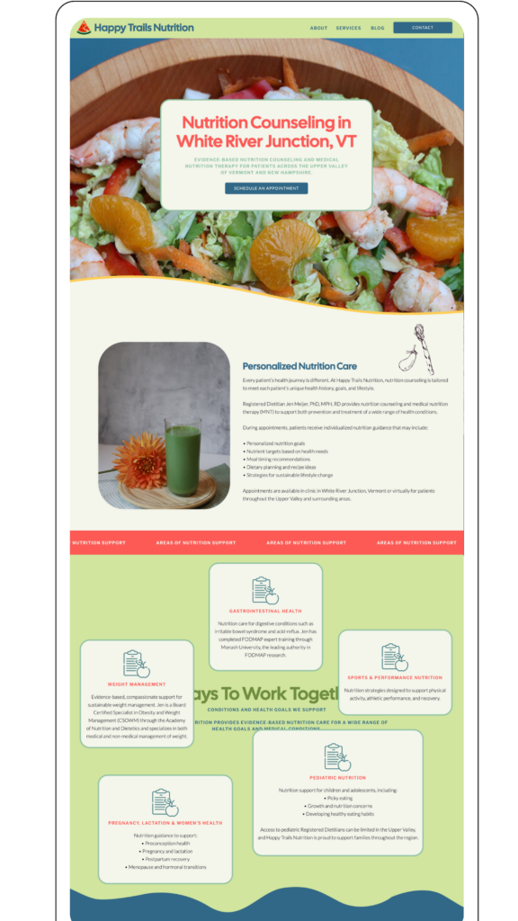
Happy Trails Nutrition
This is a great example of separating services from logistical clarity in a strategic way.
The services page itself is focused and easy to navigate, while the dedicated insurance page creates a separate space for deeper logistical information. This is something many nutrition websites overlook, but it is actually a strong SEO and user experience opportunity.
Having an insurance-specific page allows you to rank for highly intent-driven searches while also keeping the main services page focused on conversion.
This is also something worth noting as a potential expansion point for nutrition websites that accept insurance or offer superbills, since it can significantly improve both clarity and discoverability.
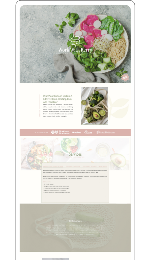
Good Gut Nutritionist
This is a strong example of symptom-led positioning within a services page structure.
Instead of starting with abstract service descriptions, the page immediately connects to the problems clients are experiencing, such as digestive symptoms and confusion around food choices.
It also does a strong job of breaking services into clear pathways, making it easy for visitors to self-select the right type of support without overthinking.
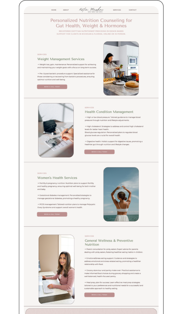
RDC Katia
This services page is a strong example of simplicity and direct communication.
The structure is minimal but effective, which makes it easy for visitors to quickly understand what is offered without feeling overwhelmed.
It leans heavily on clarity of messaging rather than volume of information, which is often what helps service-based websites convert more effectively.
Final takeaway from these examples
Across all of these websites, the strongest services pages are not the ones that explain the most. They are the ones that make decisions easier.
They follow a clear structure: they connect to the visitor’s experience, build trust, simplify service options, and reduce uncertainty around next steps.
When you apply a similar approach, your services page stops feeling like a list of offers and starts functioning as a guided decision-making experience.
Bringing It All Together
A strong nutritionist services page is not just about listing what you offer. It is about helping the right person feel confident enough to take the next step.
If you are a nutritionist or dietitian updating your website, the structure you use on your services page can completely change how visitors experience your brand. When it is clear, intentional, and focused on your client’s needs, it becomes much easier for someone to move from interest to inquiry.
If you are ready to create a services page that feels more strategic and aligned with the clients you want to work with, this is exactly the type of work I support inside my website design process at Unica Formo.
A well-structured website should not just look good. It should guide the right people toward working with you.
Frequently Asked Questions
Is this nutritionist services page structure meant to be followed exactly?
This structure is meant to act as a flexible framework rather than a strict template. Every nutritionist or dietitian will have slightly different services, audiences, and positioning, but the overall flow is designed to help visitors move from understanding what you do to feeling confident about taking the next step.
Do I need all of these sections on my services page?
Not necessarily. The goal is not to make your page longer, but to make it clearer. Some nutrition websites may need more explanation in certain areas, while others may need less. What matters most is that your page guides the visitor logically from introduction, to trust, to services, to action.
Why is structure so important on a nutrition services page?
Because most visitors are not making instant decisions. They are scanning for clarity, reassurance, and relevance. A strong structure helps reduce confusion and makes it easier for someone to understand whether your support is right for them without needing to dig for information.
Can I use this structure if I only offer one service?
Yes. Even if you only have one main offer, the structure still helps you organize the page in a way that builds trust and removes uncertainty. Instead of comparing multiple services, the focus becomes clearly explaining who the offer is for and what the experience looks like.
How does this help improve conversions?
A clear structure reduces decision fatigue. When visitors can quickly understand what you offer, who it is for, and what happens next, they are more likely to take action. Most nutrition websites do not struggle because of lack of credibility, but because the information is not presented in a way that supports decision-making.
Pin for Later:

Jordin Brinn is the founder and lead designer of Unica Formo — a creative studio in Columbus, Ohio, specializing in custom Showit website design and brand strategy for service-based businesses like coaches, consultants, therapists, creatives, and wellness professionals. With over a decade of business experience, she helps clients bring strategy, clarity, and personality to their online presence.
Explore design services and free resources at unicaformo.com.


